
June 2010 Edition
Computer Science Department, University of Cape Town
| MIT Notes Home | Edition Home |
| MSc-IT Study Material June 2010 Edition Computer Science Department, University of Cape Town | MIT Notes Home | Edition Home | |
The previous section and the previous unit have discussed some of the ways that humans are able to experience the world they inhabit using their visual, auditory, and other senses, and the importance of understanding the properties of these senses when designing user interfaces. It is clear that the world presents an extremely rich and complex set of stimuli to the senses. It is only by filtering out some of this, and ignoring the rest that we are able to make sense of the world around us, instead of being hopelessly confused by it. The processes by which humans are able to focus on some things and filter out others, to concentrate on certain mental or perceptual events and devote less mental resource to the rest, are known collectively as attention.
Every one knows what attention is. It is the taking possession by the mind in clear and vivid form, of one out of what seem several simultaneously possible objects or trains of thought. Focalization, concentration, of consciousness are of its essence. It implies a withdrawal from some things in order to deal with others.
This oft-quoted passage from one of the founders of modern psychology captures some of the essence of what we mean by attention. At the heart of the concept is the idea that there are limits to our cognitive and perceptual capabilities, and that multiple demands are almost always made on these limited resources. Some form of "filter" or selection process is required so that we can focus on only a subset of the possible mental and perceptual activities; this process of focusing is known as attention.
We are able to choose a single stimulus from the many of offer on which to focus on using what is often referred to as selective attention. However, we can also engage in a number of activities and focus on a number of things simultaneously, in which case out attention is said to be divided. The selection of what to attend to may be the result of conscious deliberation, or deciding to concentrate on something specific, or may arise from unconscious or involuntary responses to things that "grab our attention".
Much of the psychological research on attention has focused on the ways that people are able to direct their attention to particular perceptual events in their auditory experience. However, many of the points that are made and theories that have been developed can be generalised to other senses and other mental processes.
We can fail to pay attention to the appropriate thing for a number of reasons, and the consequence is likely to be that we fail to complete a task as we intended, or substitute an incorrect task instead.
Does the following story, as told by psychologist James Reason, sound familiar?
Imagine you have a visitor who has requested a cup of tea, while you only drink coffee. You go to the kitchen intending to prepare both tea and coffee, but return with two cups of coffee. The reason for this slip is clear; you failed to make an attentional check on your plan at the point where the initial common pathway, boiling a kettle, branches into its separate tea- and coffee-making components. As a result, you proceed along the habitual coffee route.
In general, a number of possible consequences can result from inattention. The kind of unintentional error or "slip" exemplified above, where through a failure to pay attention, a person carries out a more familiar task instead of a correct, but less familiar one, is known as a capture error. Related to this is a memory lapse, where something is simply forgotten because we aren't paying attention. Common examples are using a photocopier, but failing to remove our original document at the end, or using a vending machine, but failing to take the change.
A third class of attention-related problem occurs when we are simply distracted from one task by some other stimulus or task. An example when we stop working at the computer to answer the telephone. Sometimes the distraction is unwanted and unnecessary (such as the distraction caused by blinking text on a web page) and sometimes, even if the distraction is desirable (such as an important telephone call) it creates problems when we attempt to resume the original task.
A further kind of problem arises if our attention is not focused on something important. For example, we can miss the arrival of new e-mail unless we happen to be attending to the icon that announces its arrival. Of course, the effect of failing to attend to the right thing is not always so trivial, as the following example illustrates.
A serious air accident resulted when the pilots of an aircraft incorrectly located the source of an engine problem their aircraft was having as being in the right engine (it was actually in the left engine). The pilots shut down the healthy engine and the aircraft subsequently crashed as it was attempting to land.
An instrument on board the flight deck could possibly have revealed the source of the problem, had the pilots noticed it. It is, of course, all to easy to blame the pilots for making an incorrect decision, but it is much more worthwhile to look at how attention getting characteristics designed into the user interface had a part to play.
The relevant instrument (lower right, underlined in white, in the picture below) was part of a panel containing several other dials, itself part of a mass of controls, dials, instruments, and computer screens on the flight deck. The dial in question has no alert or other mechanism to attract the pilots' attention to the fact that it was displaying an out-of-normal-range value. In fact the normal and abnormal ranges are not even shown on the dial at all (e.g., with a "red zone", as on many of the instruments) Therefore, there was nothing to encourage the pilots to focus on this item in preference to all the other possibilities.
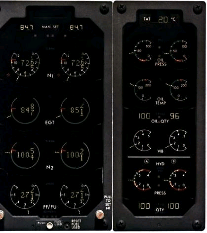
Note that the contribution of the dial design was only one component in a complicated series of occurrences that lead eventually to the accident, which is described from a different perspective in Unit 2.
As has already been said, at the core of the concept of attention is the idea that we have only a limited capacity for perceiving the world and carrying out mental and physical tasks. We therefore need choose from the large number of competing possibilities, a small number of things to concentrate on. A number of factors connected with the stimuli we receive, the way our mental apparatus processes them and our state of mind at the time affect the way we are able to achieve this focusing.
These include the following properties of the stimulus
Movement and change – the human eye is able to discern great detail, but only in the central part of the visual field. In other parts of the visual field (the "peripheral vision"), we are not particularly good at seeing detail and colour, but are very good at spotting movement and change towards which we can direct our attention. This is why it is possible to notice that something is happening "out of the corner of ones eye", without seeing exactly what.
Colour, size, intensity– certain colours tend to be particularly good at attracting our attention. Similarly if one object is physically larger, brighter, bolder or more visually intense than surrounding ones, then it is more likely to attract attention
Number of competing stimuli – the greater the number of possible things to attend to, the less attentional resource there is to devote to each.
In addition to these properties of stimuli, two factors concerning the human observer have an impact on how and where attention is directed.
Meaningfulness – we are more likely to focus on things that are meaningful or understandable or make sense to us. One aspect of this is a phenomenon sometimes referred to as the "cocktail party effect" Imagine you are at a party or in some other situation where a crowd of people are talking. There is a constant level of background sound, yet it is possible to pick out words and threads of other conversations across the room. We are especially good at doing this if the content of the conversation is meaningful to us – for instance, if we hear our name mentioned in someone else's conversation, we can "tune in" and listen to what is being said.
Emotional state – in a particularly stressful or pressured situation, a person's attentional capacity tends to be diminished, meaning that they are able to focus on fewer things at once. This fact may not be very significant for the design of web sites and desktop systems. However it is highly relevant for the design of systems such as aircraft flight decks. If designers are not careful, there is a tendency to place the greatest attentional burden (e.g., lots of visual tasks to be carried out) on the user at precisely the most stressful times (e.g., landing the aircraft).
The following exercise is taken from Preece et al. (1994), pages 102-103.
You can carry out this exercise by yourself, but it will be easier and more reliable if you are able to get someone else to help by carrying out the timing. The two figures below are alternative presentations of the same kind of data. With the first display find out how long it takes you to find (1) the phone number of Howard Johnsons in Columbia and (2) the name of a motel with a double room for $46. With the second display find out how long it takes to find (1) the telephone number of a Holiday House and (2) the name of a hotel with a double room for $27.
Which display takes the longest? Why do you think this is?
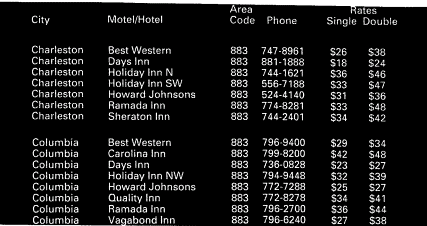

A Discussion on this activity can be found at the end of the chapter.
In order for a user to be able to successfully use a computer system, it is imperative that they be able to direct their attention to the right thing at the right time. In the remainder of this section, we outline some of the measures that designers can take to help users to focus their attention on the parts of the user interface relevant to their task, and to remain focused and not be unnecessarily distracted.
Let us take as an example the design of web pages. The kind of question a designer or usability analyst should be asking is: what does the user need to focus on in order to carry out their task? is the user's attention likely to be focused on these things? Or are there features of the design that tend to encourage them to focus elsewhere? If the user does get distracted and focus their attention elsewhere (sometimes this is unavoidable, and results from events outside the user interface – such as the telephone ringing or a colleague walking into the office), can they pick up the task again later and continue by re-focusing their attention appropriately?
As designers, there are a number of techniques we can use to try and ensure that users' attention will be directed towards the appropriate things for the task at hand. Although these are exemplified by pages and sites on the World Wide Web, the points made apply equally to other interactive systems.
Flashing, motion, change – these techniques may be a powerful way to attract attention, but they can often simply be a distracting annoyance to users – see the section below on attention grabbing versus helping the user to decide.
Difference – differences in colour, size, shape, intensity, and so on, can be used to make some items of a display more attention getting. For example, colour can be used to segment the page into regions that help users to focus, and to highlight important items.
Meaningfulness and importance. Users will tend to find it easier to focus on items that are easy to understand and important to their task.
Visual structure and grouping of items meaningful units can help the user to focus on the items that are relevant to their concerns. See for example BBC News website, where a large amount of information is presented in a structured way.
Simplify the choices presented to the user. Look, for example, at UCT's Department of Computer Science
Alerting mechanisms such as animations, and pop-up screens should be used with care, and only to provide warnings or supplementary information.
Spatial cues, indicating, for instance, where in a fill-in form the user currently is, can help the user focus on the parts of the a task they are currently working on.
Temporal cues, indicating where in a process or sequence of sub-tasks the user currently is. See, for example, the sequence of steps involved in purchasing an aeroplane ticket at Mango Airline. This way of depicting the steps in a process is becoming increasingly common in e-commerce sites.
Look at the following collection of web sites, and for each, consider how the page designer has built in features that can help or hinder the user in their ability to focus their attention on what's important, and to remain focused on the task at hand.
http://www.bbc.co.uk/
http://www.amazon.com
http://www.telkom.co.za
It is all very well to design user interfaces with features that attract the user's attention in one way or another, but does this really contribute to the usability of the interface?
A typical situation, which might be familiar to users of the web, is that the designer includes features that are likely to attract the users attention, presumably because the designer felt that certain parts of the interface, or certain pieces of information were especially important. If you are a designer, this might seem quite easy to do: simply decide what you what the user to look at, and make it larger than surrounding elements of the interface. Or make it more brightly coloured, or make it move or flash. It you really feel that the item is very important (e.g., if its an advert for a product the user hadn't yet realised they wanted to buy), then use all of these techniques together, and include a large, attractively coloured animated graphic in the interface. Surely, the user will be virtually unable take their eyes off the graphic and will soon forget what it was that they originally came to your site for!
Actually, if this technique does work at all, and the user's attention is captured, they are likely to find it distracting and annoying. Users are likely to stop using the site and choose a different one that allows them to carry out their task without being bothered animations and so forth.
A better alternative might be to accept that the user might be best placed to decide what is important and what is not for purposes of the task that they are trying to accomplish. The design should therefore try to support users in identifying what possibilities the interface is offering them, assessing their importance and relevance, selecting an appropriate alternative, and remaining focused on their task without unnecessary distractions.
In any case, recent research suggests that crude attempts to attract web users' attention are less than successful. A study in which eye-tracking technology was used to find out where web site users direct their gaze showed that users tend to prefer looking at text, and avoid looking at images and animations. Even when the graphics contained useful information! A finding that suggests that users have become habituated to web designers tricks and have trained themselves to overcome basic physiological and psychological responses, so as to ignore web features they imagine to be superfluous. This tends to indicate that banner advertising and other attempts to encourage the user attend to things that may not be relevant to their interests and intentions may be far less effective than designers would like to believe. It should be emphasised that this research finding is specific to the users of particular kinds of web site, and cannot necessarily be generalised to other settings and other kinds on user interface.
Of course, if the user interface emphasises nothing in particular (or makes everything look equally eye-catching) then it is failing to help the user to decide what to do. There are sometimes situations where it is useful or even vital to distract the user form what they are currently doing and encourage them to think about something else instead. These include situations where safety is at stake (such as the aircraft example described earlier), as well as more everyday systems.
In deciding what to emphasise and make more available, web page designers can often find out (from server access logs) which parts of a site are the most popular. The site can then be re-designed so as to make it easy for the user to focus on the most popular information and links.
Study the description given by Bruce Tognazzini at his web site of how progress was made on a particular, and simple sounding design problem. At each stage, consider where users were focusing their attention, and how what the designers did had an effect on this.
What is attention? What are some of the consequences of failing to focus attention on the appropriate things in a user interface?
Answer to this question can be found at the end of the chapter.
What user interface design features affect users attention focusing? In what situations might the use of each be appropriate for in a user interface?
Answer to this question can be found at the end of the chapter.
A further aspect of human psychology that is highly pertinent to the design of user interfaces is the study of memory: that is how we are able to store and remember information that is relevant to the computer systems we use and the tasks we use them for.
Every activity we engage in involves the use of our memories in one way or another. Not only is memory used in processing every input we receive from our senses, but also memory is essential for the fleeting, temporary or intermediate thoughts that are part of just about every task we carry out. At the opposite end of the spectrum, we continually need to remember facts we have learned previously about the world we live in – and the computer systems we use – in order to make decisions and carry out actions. Even when we are not aware that we are remembering things, we probably are! Skills that we acquire are often performed without conscious thought, but still require us to recall remembered abilities. Memory is just as central for an expert cyclist or a proficient typist, who may not be conscious of remembering the skills they have acquired, as it is for someone trying to recall facts during an examination, who may be painfully aware of their attempts to remember (or failures to do so).
Failing to remember can result in a number of possible errors in carrying out tasks. The kind of "lapse" or error of forgetting mentioned in the attention section, which can lead to us omitting part of a task or carrying out the wrong task, is one example of this. An HCI-related example here would be failing to save a document before quitting a word processor, or failing to bookmark a web site before quitting the browser.
Another effect of failing to remember is when we simply cannot recall how to carry out a task at the time when we need to, or fail to recall some important fact about the workings of the computer system. An example is if we are unable to recall the meanings of visual elements of a user interface. See if you can you recall the meanings of each of the icons on this toolbar from a popular word processing program:
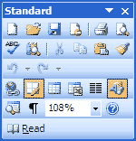
Some of the meanings are easy – the icon that looks like a printer invokes the print command – but others are more difficult – what is the meaning of the icon to the right of the printer?
A potentially more damaging instance of much the same phenomenon is if we mis-remember facts about the computer system or tasks we wish to perform with it. For example, if we incorrectly recall the meanings of the icons on the title bars of windows, we can end up quitting an application and losing work rather than simply minimising a window.

In the remainder of this section, we will look at how our memories work, and the three different kinds of memory store that studies have identified. We will then look at how what is known about memory can be used to improve user interface design.
Psychological studies have revealed several types of memory system have a role to play in human cognition, each with its own specialised function and its own properties. Central properties that distinguish these types of memory are the capacity or size of the store, the decay time or the time for which items will persist before being forgotten, and the time it takes to recall or access items.
Three classes of memory that psychologists have studied extensively are sensory memory, short-term (or working) memory and long-term memory. The following diagram (extracted from the Model Human Processor of Card, Moran and Newell, 1983) summarises the characteristics of these memories and the relationships between them. Although the figure only shows sensory stores for the visual and acoustic senses, specialised memories exist for the other senses as well.
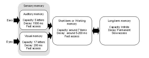 |
The first type of memory is responsible for recording information as it comes from our senses, prior to processing by other cognitive mechanisms. This so-called sensory memory acts as a kind of buffer store between the sensory organs and other forms of memory. In fact, the sensory memory is not a single entity, but a series of specialised stores, one for each of our senses. Thus images perceived by our eyes are retained briefly in the visual (or iconic) memory, and sounds perceived by our ears are stored in the acoustic (or echoic) memory. These memories store "images" of what is perceived for a short period of time, and can be thought of as being continually overwritten as new sense data arrives. In fact there are several different sensory memories: one for each of the senses, each having a different capacity and decay time, and storing images specific to a single sense.
The second form of memory is referred to as either short term memory or working memory, and can be thought of as a kind of scratch pad in which information that is the current focus of our conscious attention is stored. The short-term memory typically stores sensory data from the sensory memories, and other short-term information that is needed as mental tasks are carried out.
Typically, our senses are bombarded by a vast amount of information about the external environment, and therefore a large volume of sensory stimuli enters the sensory memories. However, we choose to pay attention to only a small amount of this, and this attentional focus allows only a part of our sensory experience to be passed on to working memory.
In addition to processing sensory experiences, working memory also serves as a kind of "scratchpad" in which thoughts are stored while they are our focus of attention. For example, if you wish to multiply 39 by 8, it is necessary to remember these two numbers, multiply 9 by 8, to produce an intermediate result, remember the 30 and 8 and multiply them together, producing another intermediate result. The two intermediate results must then be remembered and added together, a process that involves further remembering of small amounts of information, which are stored for short periods of time, and then discarded.
Working memory has only a very limited capacity – studies have shown that it typically holds between 5 and 9 items (though what counts as an item is by no means fixed). Items persist in working memory for a relatively short time – from a matter of a few milliseconds up to tens of seconds). This means that working memory is a very limited resource, and if tasks make excessive demands on it, then errors are likely to result.
"Modes" are states of a system or user interface where the controls and inputs have the same effect. A user interface may have several modes, and the user's inputs will do something different in each, is which case the user must remember which mode they are in and what effect their actions will have. (For instance, Microsoft Word has Normal and Overwrite modes. In the former, characters that are typed are inserted in to the document, in the latter, existing text is overwritten by typed characters.)
Look at the user interface of your computer (if you want, select a particular application to look at), and find places where different modes exist, and where the user must remember the current mode. What can be done to reduce the errors that are likely to result from the presence of modes and the limits of working memory?
A Discussion on this activity can be found at the end of the chapter.
The third kind of memory is referred to as long-term memory, and is an effectively permanent and infinitely large store for semantically linked information.
A number of distinctions between different forms of long term memory have proved useful in the study of memory by psychologists. The subtleties of these different classes of long term memory, and the theories about how they function are not really relevant to this module, but it is worth noting that a variety of different kinds of information are stored in long-term memory. These include:
facts about the world, computers and other devices we use, and tasks we carry out (sometimes referred to as semantic memory)
things that have happened in the past (autobiographical memory)
things to do in the future (prospective memory).
The processes by which we are able to remember items that are stored in long-term memory are complex and are the subject of much psychological research. However, a factor that greatly affects our ability to remember something is its familiarity, both in terms of its meaningfulness, and the frequency with which items have been remembered in the past.
This is why the use of graphical icons in a user interface can aid usability: the more meaningful a graphical element or a name appears to be, the more likely its meaning is to be remembered. For this reason, the meaning of menu items like "Print" and icons like

are more likely to be remembered than "Control-X" or "F4". In addition, in a given situation we are more likely to successfully recall a fact or piece of information that we have recalled often in the recent past, than something that is only occasionally required.
Example: The Unix operating system.
In order to carry out any command, a Unix user must remember a great deal about the command, such as its name, how to supply parameters, the form of the output, and so on. Even to be able to use the online help system, the user needs to remember the command name. In some cases, the names bear a resemblance to the command they denote (the move command is "mv", the copy command is "cp", the print command is "lpr"). For some commands, the name is equally suggestive of the function, but the function is less frequently used and therefore harder to recall. In other cases, the connection between the name and its function is bizarre. Take, for instance the "biff" command, whose purpose is to notify the user when email arrives:
Did You Know?
"Biff was Heidi Stettner's dog, back when Heidi (and I and Bill Joy) were all grad students at U.C.Berkley and the early versions of BSD were being developed. Biff was popular among the residents of Evans Hall, and was known for barking at the mailman, hence the name of the command."
It is, of course, possible that if an amusing story is attached to a command, then a chain of associations between the command and the means of invoking it is produced, making it more memorable. But this is hardly a workable principle for the design of user interfaces!
Investigate how much expert users know and can recall about a computer system they use routinely (obvious examples would be popular word processors, email programs, or web browsers). In particular, find out how much they know about the commands that are available, how the commands are named, and how they are accessed through the toolbars, menus and icons on the screen. A good way to do this would be to plan a structured interview or a questionnaire, to probe the user's knowledge of a selection of frequently used and less popular functions that the product supports.
A Discussion on this activity can be found at the end of the chapter.
Memory research has shown that humans are far better at recognising material presented to them than they are at recalling material from memory.
One of the difficulties with text-based command-line user interfaces, as the Unix example above shows, is that the user interface affords very few opportunities for recognition, and relies almost totally on the user being able to recall the relevant commands from memory. Graphical user interfaces, on the other hand, make use of menus, icons, and similar devices to provide the user with on-screen representations of the commands that are available. The mental act of recalling how to carry out a particular function is therefore transformed into the rather less demanding task of recognising the visual representation of a command. In general, we are able to combine information we recognise in the environment with that recalled from memory in deciding how to act.
Experimental research in HCI suggests this is precisely the way people make use of menus and similar visual interface features. Even experienced users of a system have a very poor recollection of what menu items appear where in an interface, how they're labelled, and so on. What this means is that in order to be proficient at using a computer program, it is not necessary to remember precisely how the user interface works. It appears that instead, users decide what action to take largely on the basis of matching options and functions displayed on the screen (e.g., as menu items and headings) with their current goals and intentions. For example, if the user wishes to save the current document, they may well look for items that are relevant to this goal. Of the options that are available, the "File" menu tab will be recognised as the most relevant, leading the user to pull down that menu. Once the menu appears, a number of options appear, allowing the user a further opportunity for recognising the one that is most relevant: in this case "Print".
Donald Norman (see Norman, 1988/1990) has discussed the difference between recall and recognition in terms of the location of knowledge as being "in the head" or "in the world". What this means is that our actions are often governed by bringing together information that we recall from memory and information that is present in the external world. In everyday life, we frequently arrange our environment so as to place important information "in the world" where it is less susceptible to being forgotten or mis-remembered. Familiar examples of this are when we write notes to ourselves or lists of things to do at a later time, thus "off-loading" the responsibility for storing them.
As designers of interactive systems, it is possible to achieve similar effects, by placing important information about how a system works in the user interface, rather than relying on the users remembering it.
From the discussion above, it should be clear that an understanding of how human memory works is very useful in designing human-computer interfaces. Some key points to bear in mind when designing user interfaces are:
Reduce working memory load – try to minimise situations where the user must remember temporary information. For example, if the user needs to makes use of selections made earlier in a dialogue, then the choices made should be displayed so the user doesn't have to remember them.
Recognition of interface elements presented to the user is far more effective that requiring the user to recall how to use a system
Therefore, where possible put the knowledge about how a system should be used into the user interface.
Graphical user interfaces typically require far less mental effort that text-based ones as they put more knowledge and information in the user interface. This allows the user to recognise what is in the interface, rather than having to recall facts from their memory.
The use of meaningful and easy to understand icons, text labels, and menu items is a way to do this and therefore reduces the burden on the user's memory.
User interfaces in which commands work in a consistent way reduce memory demands on the user. For instance, in Microsoft Word, the TAB key inserts a tab character – most of the time. When the cursor is inside a table, the TAB key moves the cursor on to the next box in the table! The designers have therefore forced the users to remember and recall an extra item from memory: the rule that governs how TAB behaves inside a table.
Working memory is said to be limited in capacity to 7 +/- 2 items. What implications does this have for the design of menus in standard computer systems? Does it have implications for any kind of menu?
Answer to this question can be found at the end of the chapter.
What is the difference between knowledge in the head and knowledge in the world? Why is it important for user interface design?
Answer to this question can be found at the end of the chapter.