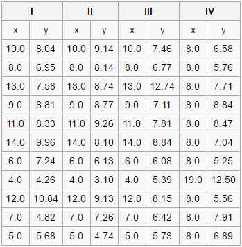
Figure 1: Four sets of data.
Figures (graphs, charts, and graphics) are an additional means of communicating information about systems, algorithms, dynamics, and perhaps most importantly, data. Good figures make it easier and faster to communicate certain information, and can play a crucial role in the structure of a paper. This chapter will focus on highlighting some of most important areas to focus on when creating figures.
It may seem obvious, but the first and foremost objective of a figure is to show the data. Figures have an amazing ability to quickly reveal information about data that might otherwise be difficult to detect or understand. In fact, a graphic can give far more precise insights than even statistics can in some cases. Consider the four sets of data below:
Figure 1: Four sets of data.
The four sets of data shown in Figure 1 have some interesting properties. For each of them the following are true: - Sample size = 11 - Mean value for X = 9.0 - Mean value for Y = 7.5 - Equation of regression line: Y = 3+0.5X - standard error of estimate of slope = 0.118 - t = 4.24 - Sum of squares = 110.0 - Correlation coefficient = 0.82
As you can see, many of the statistical tools we usually rely on to give us information about a data set are telling us that each of these four data sets are identical. The data sets have the same number of elements, the same mean for both the X and Y values, etc. After some statistical inquiry, we might be tempted to suggest that these four sets of data are the same. However, once these four data sets are plotted as graphs (Figure 2), the differences between them, and their important individual characteristics, are immediately obvious:
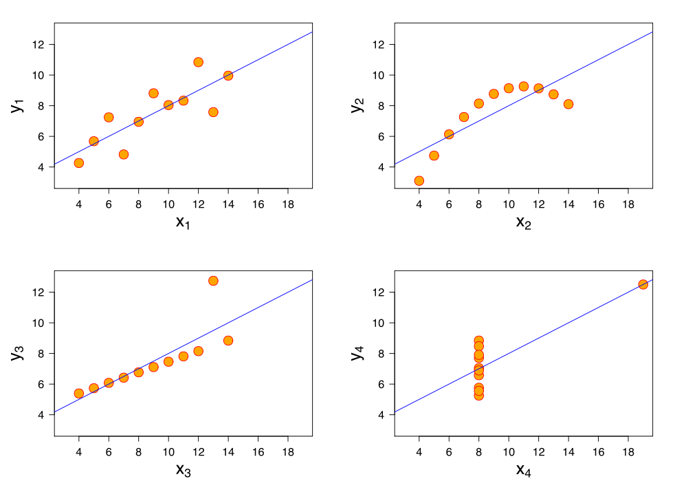
Figure 2: Scatter plots of the four data sets shown in Figure 1.
These four sets of data are known as Anscombe's quartet, and are an excellent example of the power that graphics have to reveal information about a data set that might otherwise remain hidden.
The data-ink ratio of a figure is the proportion of elements of the graphic that are actually communicating data. A good figure should attempt to maximise the data-ink ratio as much as possible, eschewing unnecessary elements which don't communicate any new or useful information. Decorations or otherwise overly busy graphical elements might sometimes look good, but they can get in the way of the primary function of the figure, distracting the viewer from the data rather than revealing it to them.
To maximise the data-ink ratio in a figure, try to identify useless graphical elements by answering the following questions:
Figure 3 has a great deal of non-data-ink. The elements indicated by the red arrows don't communicate any information at all.
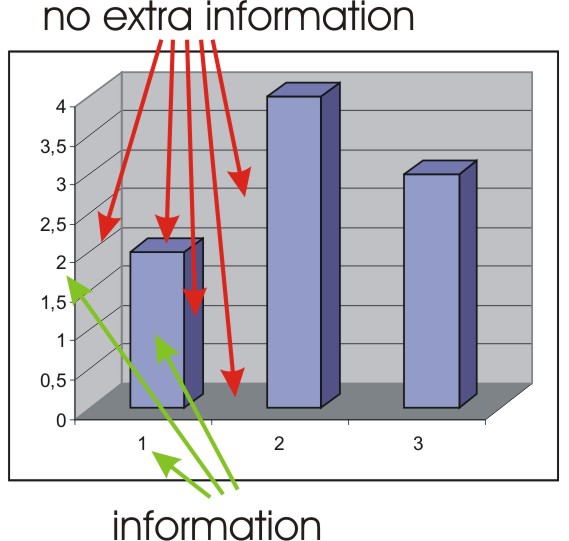
Figure 3: A bad graphic.
Consider the bar from a bar chart in Figure 4. It communicates only one piece of information, but in many ways. We don't need all of them. The number, the height of the bar, the shading within, etc. are all communicating the same piece of information that any one of them could communicate all on its own. This is an example of redundant data-ink.
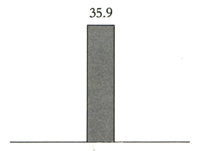
Figure 4: An example of redundancy.
These questions are based on Edward R. Tufte's "Two Erasing Principles" which aim to increase the data-ink ratio: 1. Erase non-data-ink (within reason) 2. Erase redundant data-ink (within reason)
Non-data-ink is sometimes referred to as "chartjunk". Some forms of chartjunk are so common that one might not even notice them. The erasing principles above will help identify unnecessary elements, but some very common examples are highlighted in this section.

Figure 5: Moiré vibrations.
Many graphs and charts rely on various dense repeating patterns line parallel lines to differentiate between elements. An example of this can be seen in Figure 6. Due to the physiology of the human eye, lines like this sometimes appear to be moving slightly or otherwise distorted (this is known as the moiré effect which is highly exaggerated in Figure 5). This can make elements more eye-catching, but it can also be very distracting, not to mention that all that ink communicates no data whatsoever.
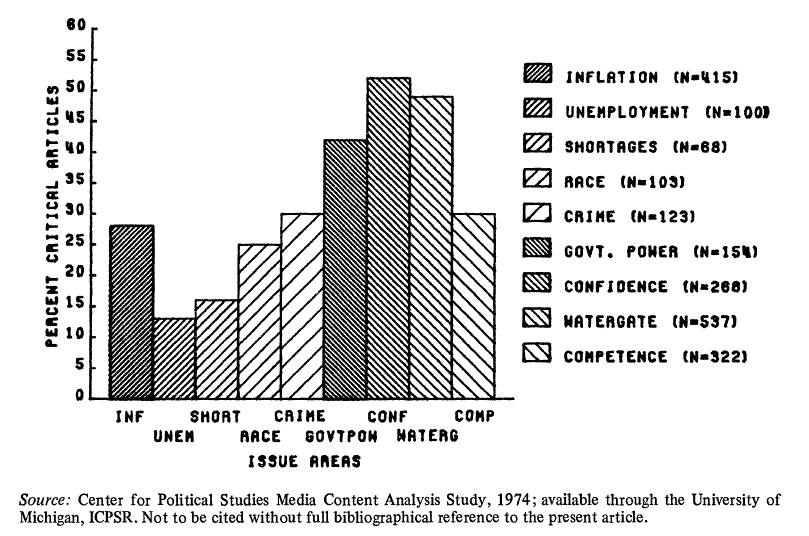
Figure 6: Vibrating lines used to distinguish data.
Try to avoid using vibrating lines or other dense repeating patterns to differentiate between chart elements.
Grid lines are so ubiquitous that one might not think to question them at all. However, especially if the grid lines have a weight similar to that of the important data elements or if they are very closely spaced, grid lines can distract from the data. Often, grid lines fall into the redundant data-ink category, needlessly reiterating information that is readily available from other elements of the figure.
Figure 7 is timetable for trains running between Paris and Lyon. The think and densely packed grid lines compete with the information that the graphic is intended to convey.
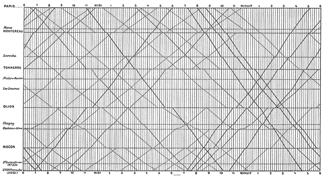
Figure 7: The famous Marey Train Schedule visualization.
It is made far more legible by thinning the grid lines and making them a lighter shade (Figure 8).
Figure 8: An improved version suggested by Edward R. Tufte.
If you must use grid lines, make sure they are finer than the lines/points used to communicate the data, and that they contrast less from the page than the data. This way, they are still useful, but are far less obtrusive.
Occasionally one will come across a particularly bad graphic that sacrifices all legibility for decoration. They can be very eye-catching, but often conceal the data rather than reveal it. Such graphics are known as "ducks".
Figure 9 is regarded by some to be the worst figure ever to be printed:
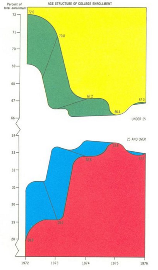
Figure 9: A graphical duck.
While eye-catching, this graphic has many problems. All in all, it only communicates 5 data points - the proportion of enrolled students under the age of 25 from 1972-1976. The colours and the fake 3D effect add no new information (they are pure non-data-ink). The top half of the graph is actually just the inverse of the lower half (redundant data-ink), and the values of it are represented by the empty space below it, rather than the coloured part above it, the opposite of the lower part. Finally, the broken y-axis distorts the data to make it appear more interesting than it actually is. Although very boring, Figure 10 is a much better representation of exactly the same data:
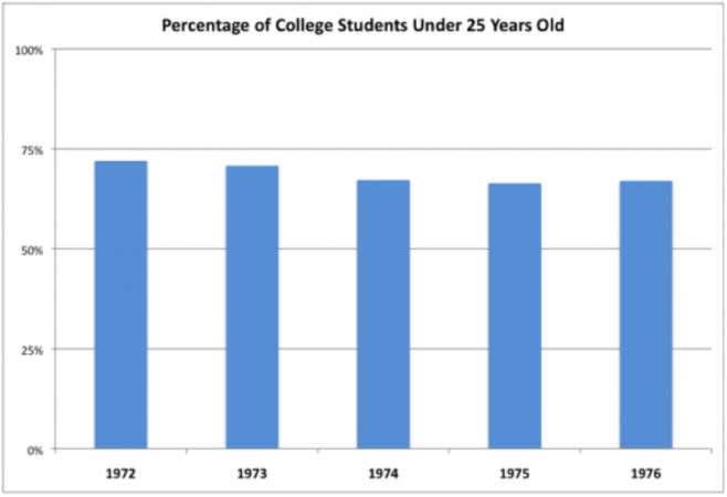
Figure 10: A boring but accurate representation of the same data shown in Figure 9.
Show the data, maximise the data-ink ratio, erase non-data-ink, erase redundant data-ink, and you will avoid making a duck.
By changing certain aspects of a figure, it is possible to distort the data rather than reveal it for what it actually is. Several such distortions are discussed in this section.
Earlier in this chapter we looked at Anscombe's quartet and saw that different sets of data can lead to the same line of regression. Lines of regression can be very useful for communicating a general trend, and give your data some predictive power. However, regression lines can be very sensitive to outliers, and must be used with care. Importantly, they must always be shown with the points that were used to generate them.
3D effects are often used and almost always purely decorative. Their usage not only diminishes the data-ink ratio of a graphic, but the perspective distortion needed for the effect can distort the data too. Consider the pie charts shown in Figures 11 and 12:
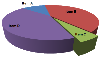
Figure 11: 3D pie chart.
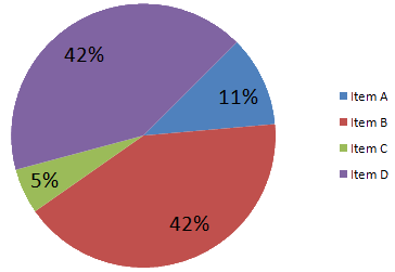
Figure 12: 2D pie chart.
In the 3D version (Figure 11), "Item C" appears to be about the same size (if not larger) than "Item A". In the non-distorted 2D version (Figure 12), it is easy to see that Item A is actually much larger (more than twice as large in fact) than Item C. Both the 3D effect and the lack of proper labelling distort this data.
Another way that data can be distorted graphically is by manipulating the axes of a figure. The two bar charts (Figures 13 and 14) show exactly the same information. The y-axis of Figure 13 has been truncated (ranging from 9100 to 9800), making the difference between the groups seem much greater than it actually is. The more accurate Figure 14 shows just how much the data has been distorted. Sometimes it is necessary to truncate an axis, but care must be taken to alert the reader to this fact.
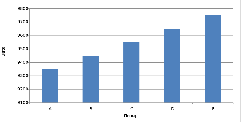
Figure 13: Data distorted through truncation of the y-axis.
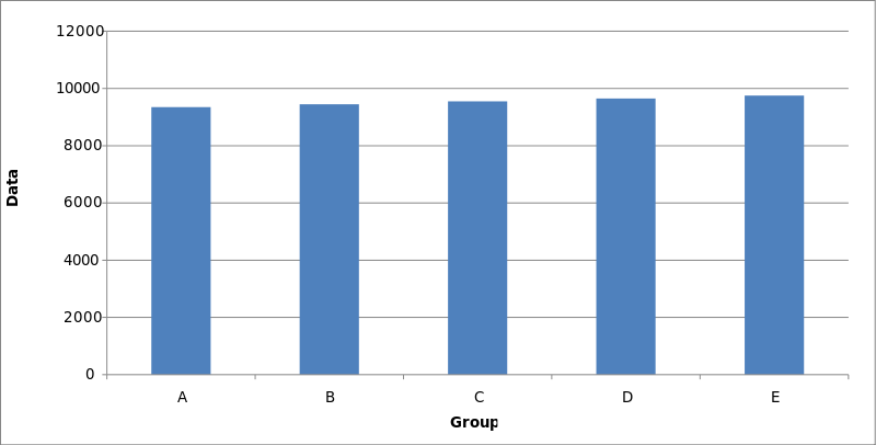
Figure 14: An accurate portrayal of the data.
So far, we have discussed some of the more theoretical aspects behind good figure design. There are several more practical concerns that must also be addressed. Many of these focus on the usage of figures as key components that form part of the structure of a greater work.
Every figure should have a title. The purpose of the title is to concisely inform the reader what the figure is meant to convey.
Earlier in the chapter, in the Ducks section, we looked at a particularly bad figure. The title was one of its issues. "Age Structure of College Enrolment" does not mean much, and certainly doesn't capture what the presentation of the data is meant to reveal. The revised title, "Percentage of College Students Under 25 Years Old", is far better. It is less ambiguous, and describes precisely what the graph sets out to present.
Titles should be concise, but give enough information so that the reader knows immediately what the function of the figure is. A good rule of thumb to follow is that the title should be of a form similar to: (Vertical axis quantity) vs. (Horizontal axis quantity) for (Experiment).
The title should be preceded by an identifier such as "Figure 1:..." to facilitate references to the figure from the body of text. Depending on the format of the work, the title may be the first sentence of the Caption.
All figures should have a caption. The function of the caption is to give the reader all of the information they need to fully understand the figure, and summarize what it presents.
The caption should mention what exactly is being plotted in the figure (which statistics, or which data), the origin of the data, the context within the paper, and any auxiliary information required to understand the figure. If applicable, samples sizes and summary statistics should also be mentioned. Where necessary, the caption should contain citations to referenced work.
A good caption will allow a figure to stand "on its own", without further explanation in the body of the text. This is important because, for many readers, the first skim read through a paper will rely heavily on the figures to start building an understanding of the entire paper.
We have already touched on the importance of axes as a part of how to accurately represent data. Axes should conform to the following:
All figures included in a paper should be referred to at least once in the body of the text. The purpose of the figure is to aid understanding of information that is being presented, and the figure should be clearly linked to this information so that it can be easily found if and when required by the reader.