
June 2010 Edition
Computer Science Department, University of Cape Town
| MIT Notes Home | Edition Home |
| MSc-IT Study Material June 2010 Edition Computer Science Department, University of Cape Town | MIT Notes Home | Edition Home | |
Design techniques are applied during the design process in order to try and produce a system that is more usable. Summative evaluation techniques are applied when most of the design has been done and a tangible system has been produced. Evaluation is performed by giving a system to users and studying how they use it. Therefore evaluation can only take place when there is a tangible system to study. While design is taking place there will not be such a tangible system.
During the early stages of the waterfall design process nothing tangible is actually produced. The early phases are about having and organising ideas about how to go about solving problems. These ideas exist on bits of paper or completely abstractly in the designers’ heads. They are therefore quite cheap to change if a mistake is found.
Later in the process actual tangible products are generated. These are much more expensive to change.
A correct design step selects an option from the design space that solves the required problem. A good design step selects an option from the design space that solves the required problem well (e.g. efficiently, cheaply, etc). A good design step is by necessity correct, but not necessarily vice versa.
Evolutionary development is best described by the task artefact cycle. It describes how the use of objects can change through time, and how the design of those objects needs to be updated to match those changed uses. This change of needs, use and objects through time is what evolutionary development is all about.
Rapid prototyping actually involves users in the design, whereas the other techniques for user centred design rely on more abstract theories of user behaviour.
Based on the analysis given the first option is probably the best. Screen real estate is the largest consideration to be made and therefore the second option is ruled out on those grounds. The third option is appealing, but even so it would still possible for the user to get lost in a deep menu hierarchy. The first option may limit the telephone functionality, but 258 functions should be far more than sufficient for a mobile phone. If more than 258 functions are required, this should raise much more fundamental questions about the design of the phone. The fact that the second option gives the user perfect knowledge as to where they are can be discounted to a great extent, because giving the user perfect knowledge is probably unnecessary, and that giving the user hints is probably sufficient.
However the option space we have described in the example is small. In particular there is no reason why the designer cannot implement combinations of the options. In this light a combination of options one and three gives a very good solution as it would have no seriously negative criteria.
Because of the size of the user population devising a questionnaire would be the best solution. As well as designing the questionnaire well you need to consider how you are going to induce users to answer it. If you are delivering the product over the web then you could make answering the questionnaire a preliminary to downloading the product (but beware, this means the user will not have actually used the product). You may instead wish to offer an incentive like free support if the user completes the questionnaire.
Mainly because users do not read manuals. This is not the users’ fault; they have much better things to do with their time than trawl through manuals, none of which make very interesting reading. A well designed, usable consumer product should not need a manual.
Discussion point
Discuss the process you went through in this unit and unit 2 to analyse and redesign a web browser. What have you learnt? In particular we wanted to show that designing for usability need not be very difficult. In subsequent units you will be introduced to some complicated techniques that may daunt you.
Consider the amount of effort you have put into this analysis: it should have taken you about three hours. But with just a few hours of gathering evidence and careful critical thinking we have come up with a redesigned web browser that we claim is better suited to what we do with the web. We have employed no special skills other than critical thinking. Microsoft spend a huge amount of money per year on usability testing, but we have suggested improvements to one of their most visible products in a few, cheap hours. Why is that? Who is in the wrong? Us or Microsoft? Why do Microsoft spend this amount of money when it apparently does not greatly improve their products?
Returning to the mobile phone menu problem we discussed in the usability engineering section, a question may be ‘How to prevent users becoming lost in menus?’
Options for this question could be:
to flatten menu hierarchies to a maximum depth of three,
to give textual feedback as to the current menu display (e.g. display the text ‘Address book : Edit : Add number’ to show that the user has selected the ‘Address book’ option from the main menu, the ‘Edit’ option from the Address book menu, and ‘Add number’ option from the edit menu.
to give graphical feedback as to how deep the user is in the menu hierarchy by shifting each new menu selected a little down and to the left, giving the impression of stacking up menus.
For each of these options there are several criteria effecting whether or not it is a good design decision:
Screen real estate
Limited functionality
Accurate user knowledge as to where they are in the hierarchy
Now we can go through discussing each of these criteria for each of the options.
If menu depth is kept to a maximum of three then:
this has no real effect on screen real estate,
it limits the functions that can be placed in the phone. Say a maximum of six items per menu can be displayed, then there is a maximum of 258 functions that the phone can perform,
keeping the menu hierarchy flat, improves the chances of the user remembering where they are.
If textual feedback is given then:
there will be problems with screen real estate, textual descriptions take up a lot of space,
there is no limit to the number of functions,
user knowledge of where they are will be very accurate.
If graphical feed back is given then:
screen real estate can be efficiently used,
there is no limit to the number of functions,
the user will have a prompt as to where they are in the hierarchy, but not a very accurate one.
So for the question we have identified three options and three criteria which effect those options.
The answer is to where the browser finishes up after press Back twice is: ‘it depends’. If you moved from page to D by following links then pressing the back button twice will put you on page C. If you went from D to B by pressing the Back button twice then pressing the Back button twice on page H will send you to page A.
It turns out that what the Back button does is simple: it moves you back one place in the list of pages on the Go menu, but what is actually on the Go menu is not easy to work out, and therefore what the Back actually does is not very predictable. If you are on the top page on the Go menu then jumping along a hyperlink adds the new page you jump to on to the top of the Go menu. If, however, you jump along a hyperlink when not at the top of the Go menu then the pages above the current one are deleted from the Go menu and replaced by the page jumped to. The Go menu is therefore no a complete history of where the browser has been. Many users are not aware of this.
Think about a menu system on a normal computer with a full sized screen. It is difficult for the user to get lost within that menu system, because the computer gives very explicit feedback as to where the user is in the menu hierarchy. On a restricted size screen there is no room to give the user such obvious feedback as to where they are, so you must consider (at least) two things: ways of giving the user feedback as to where they are which uses very little screen real estate, and ways of making the menu hierarchy simple enough that the user does not get lost.
A sketch of my interface is shown below.I have made the navigation controls into a floating window and made the back button largest in that window. The Go menu now drops down from the navigation window and the bookmarks can also be shown in a floating window. The URL of the current page is shown across the top of the web page window and can be edited. All other functionality is in the menus. I have moved the ‘New navigator’ function out of the menus and onto the navigation window. I use multiple windows a lot and find it annoying having to rattle about in the menus to create a new browser. Also, instead of starting a new browser with the predefined ‘home page’ it creates a copy of the current page. This is so that when I find a page with several links on it that are interesting and I may want to come back to I can easily make a copy of that page and come back to it later to investigate the other links.
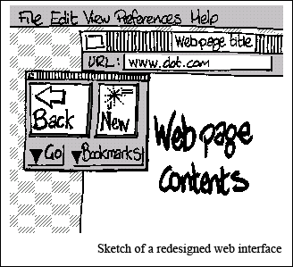
I have sketched out this interface to support my use of the web, your use may be different, and therefore you will have hopefully come up with a different design. So much the better.
If Mozilla Firefox and Microsoft Internet Explorer show feature accretion then that is because Mozilla and Microsoft consider that loading their applications up with as many features as possible is an advantage. Putting many features in a product can give that product the appearance of being ‘powerful’ or ‘professional’. An argument that those features are useless, and worse, get in the way, is much less tangible and difficult to demonstrate, and therefore does not become much of a negative point.