June 2010 Edition
Computer Science Department, University of Cape Town
| MIT Notes Home | Edition Home |
| MSc-IT Study Material June 2010 Edition Computer Science Department, University of Cape Town | MIT Notes Home | Edition Home | |
To understand what processes our brain uses to understand and store the input (symbols) it receives.
By understanding how our brain processes information, we can design interfaces, which exploit the strengths of how our brain works.
Context gives meaning to a symbol. Without context, symbols such as the box with a cross in it can be ambiguous. Context can remove that ambiguity.
A gestalt is a recognisable form; a standard object which our perceptual system can readily identify. Examples range from geometric shapes, through to more complex common structures, like wineglasses.
Moire effects arrive from the perception of movement, a shimmering, in lines that are grouped too closely together. Essentially it tells us that we cannot trust our visual perception – patently the page is not moving but yet we see movement.
Popping is the sudden appearing and disappearing of detail as you move around in virtual reality. This is at odds with optic flow, which says that detail changes in a smooth way, as our eyes are able to detect gradually more and less information.
Constructivists say that we only perceive images once our brain has worked on them. Ecologists say that a scene is perceived as soon as the light from that scene is received by our eyes.
Ecologists tell us that affordances are acted on without processing by the brain. Therefore humans will attempt to push this door before our brain has a chance to process the word “Pull” on the handle and tell our conscious selves to pull instead of push.
One group of symbols which have different meanings are arrows. For instance the back arrow can mean “scroll left” or “Undo” or “Go back to previous Web page” depending on context. Actions tend to be more ambiguous than nouns as nouns refer to concrete static objects whilst actions describe transformations to nouns which happen over time – this could be solved by providing animated icons.
No answer is possible to provide here as it relies entirely on how you perceive the Web.
The triangles represent bleach. The crossed out triangle obviously means no bleach.
The squares are the tumble dryers. The dots in the centre of the squares represent the heat at which the garment may be dried – three dots being the hottest.
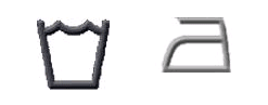
The third row of symbols represents ironing. Again, the dots represent the heat of the iron.
Finally, the last row represents how the garment should be washed. Dots denote temperature and a hand in the bucket would indicate hand wash only.
These symbols would be more effective if laundry equipment (e.g. irons and washing machines) used the same symbols so that the user need not even understand the meaning of the symbol. This is the best solution as you will discover when you try to design alternatives that they will most likely only make sense to you. If you sell garments worldwide, symbols will inevitably be miss-interpreted.
Possibly. It may be possible to better separate the water line from the hand line. However, our perceptual system, using the gestalt laws allows us to group the water and the hand separately, so they are not confused.
Simply remove the horizontal lines (apart from the X-axis) and the right-most vertical line. You may want to replace the horizontal lines with lines drawn in light grey rather than remove them altogether in order to improve accuracy of reading the Y-axis (if this is important).
In the first dialog box, light grey lines are used to enforce grouping. Proximity is therefore used to group functions, which have a similar task, or work on the same object (file, clipboard etc.) Shape similarity is also used for the table tool. Word allows the insertion of a Word table or an Excel table. The icons are identical, except the Excel table has the Excel logo placed on it.
In the second dialog box, all the functions act on the image. Shape is used to show similarity between the picture function buttons and functions (e.g. the OUT and IN options). In this case the colour of the buttons is purely aesthetic.
The usual affordance is underlined text in blue. Sometime web pages contain underlined text, which is not a link – this is a poor affordance. Also, web page authors change text colour so that you cannot be sure blue text is a link – again, a bad affordance.
Pictures which link are also confusing as picture which are not links look identical to pictures which are links. One way to improve affordance is to use “roll-overs.” Rollovers are images which change when the mouse rolls-over them.
Of course, if all else fails, look at the mouse pointer. When it is an arrow, there is no link. When it is a little hand, the object under the pointer is a hyperlink.
The menu is here as people in western culture start reading from the top left hand corner and proceed across the top until moving on to the next line. Someone from China on the other hand, reads in columns, so it might be more sensible to put the menu down the left edge of the screen.