
June 2010 Edition
Computer Science Department, University of Cape Town
| MIT Notes Home | Edition Home |
| MSc-IT Study Material June 2010 Edition Computer Science Department, University of Cape Town | MIT Notes Home | Edition Home | |
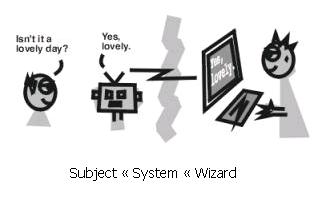
Needless to say there are many different ways to evaluate interactive systems. We will cover several representative approaches in this unit, but it is important to remember that these are just a small selection of the many approaches that have been developed. Evaluation itself can involve many different people from designers and evaluators through to actual users of the system. It is important to be clear that in an evaluation there are people conducting the evaluation (evaluators) and usually people participating in the evaluation (subjects) - potential users, evaluators, or even in some cases no-one. In order to give some idea of the variety of techniques available we shall consider evaluation in terms of the kinds of people participating in the evaluation – from users to evaluators, and finally to techniques that do not rely on anyone physically using the system.
We are interested in evaluating systems which will be used by users, so why not test the systems with people who are likely to use them? Such evaluations are the focus of this section.
In order to discover usability problems with user interfaces we can observe users attempting to use them – in which case the users are the subjects of the observation. Typically users are given tasks to perform with the user interface (these are the tasks the user interface is intended to support) and then asked to attempt to complete them. Whilst using the system the users are observed through a number of various techniques as outlined below. It is important to remember that we are interested in problems the subjects find with user interfaces rather than testing the subjects' abilities. In fact it is usually a good idea to tell subjects this before they start the test so that they realise that it is the interface that is being tested, not them.
As the idea behind this approach is to see how potential users will react to a system it is important to select appropriate users as subjects – they should be typical of the target population for the system. For instance, evaluations of cash machines will require any subjects who have, or could have, a bank account. Evaluations of equipment to monitor patients' conditions in hospital will require a more select set of subjects – those with appropriate medical training e.g. specialist nurses. Subject selection should be done before the evaluation to ensure subjects have the appropriate experience and knowledge. A simple questionnaire (see later discussions) can be used at the start of the evaluation to check that subjects are appropriate.
Firstly users may be directly observed – the evaluator watches what the user does and notes down pertinent points. Clearly the evaluators may miss important information as the user carries out their task. To address this problem sessions are usually video recorded – focusing on the important parts of the activity such as screen display and/ or mouse movements. These video recordings can then be reviewed later and interpreted at length. Several off-the-peg kits have been developed which comprise of multiple video cameras, video and audio mixing facilities, video recorders, tripods etc. These are often referred to as a ‘lab in a bag' or a ‘lab in a box' and can be relatively easily transported to different locations. These video recordings can often be used in conjunction with logs of use of the system generated by the system itself – a time stamped list of the actions the user performed e.g. pressing a button, moving the mouse to a particular position.
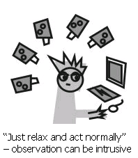
However, the more complex the observation becomes, the more it intrudes upon the user and may effect their performance so skewing the results of the evaluation. Sophisticated observations often involve the use of one way mirrors to hide the observer and their equipment from the user. Furthermore, the user may be placed in a setting similar to their normal working environment to make them feel more at ease. Alternatively, observations can be carried out in the workplace itself which gives well grounded results, but can often be difficult to set up, especially in busy working environments where the subjects may be interrupted.
Simply observing the user attempting to perform tasks may not tell us enough about the problems they are encountering. Unlike computer generated logs we can not at present easily get a direct log of their actions and intentions. Instead we have to rely on the user telling us what they were doing and why. Two approaches to generating a protocol of the task (description of what the user does and why) are possible:
Concurrent protocol – the user says what they are doing and why whilst they are performing the task.
Retrospective protocol – the user tells use what they did and why after they have finished the event. This may be done in conjunction with a transcript of the task performance, and/ or a video recording which may help trigger the subject's memory.
Choosing which approach to take is not an easy task in itself. For instance, asking the subject to verbalise their every action and intention may distract them from performing the task itself. On the other hand, subjects may not reliably remember what they did or why they did it in a retrospective protocol. Moreover, retrospective protocols rely on subjects being prepared to stay after they have performed the task to further discuss their actions – how many people would be prepared to do that?
After subjects have used a system (observed or not) plenty of useful information about its usability can be obtained from the subjects themselves. Two methods are considered here: interviews, and questionnaires.
Observing the use of a system can give us some idea about what happens when the systems are used. However, it does not give us any idea about subjects' perceptions of the system – how they felt using the system, whether they would like to use such a system etc. In interviews we attempt to find out how the subjects felt about the system – their subjective opinions.
Typically an interviewer asks an interviewee a set of questions about their experience of the system. These questions may be structured in several ways:
Structured interviews – the questions are defined beforehand and are the only questions asked during the interview. This style of interview does not allow exploration of subjects' opinions, but does provide a set of answers which can be compared across several subjects to derive some generalisations of peoples' opinions of the system.
Unstructured interviews – some set of topics of interest in to the evaluation are defined, but the interviewer is free to choose which topics they ask, in which order, and how much they explore the topics. This approach usually does not give as easily comparable results as structured interviews, but it can be useful in identifying requirements – these are useful situations in which the full evaluation criteria are probably not well defined yet.
Semi-structured interviews – these combine the structure of the structured interview's predetermined set of questions with the flexibility to pursue topics further if they seem interesting.
Card sorting – this technique is quite different from the others. Instead of being asked questions the interviewee is given a set of paper cards with some aspects of the user interface or task written on them. They are then asked to sort the cards into groups – typically groups of similar items. In this way the interviewer can get an idea of interviewees' perceptions of the nature of the user interface and/ or the task. This perception might be quite different to what the designers envisaged.
When designing the interview it is important to remember that the interviewee's time is probably quite restricted, so the length and depth of the interview should carefully constrained – this will also save the interviewer from spending a substantial amount of time conducting the interviews as well as later transcription and analysis time.
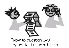
Unlike interviews, questionnaires involve subjects filling in responses to questions themselves rather than responding to an interviewer. Therefore questionnaires can typically involve a larger set of people as there is no need for the interviewer to ask each subject for their answers. Indeed, extensive use of questionnaires is usually referred to as a survey. As with interviews, questionnaires need to avoid being too long and time consuming. In addition they need to be designed to ensure enough subject response. As a rule of thumb, questionnaires should be kept within two sides of A4, and some sort of incentive will probably need to be given to encourage potential subjects to complete it. There are two main types of questionnaire:
Open questions – the subject is free to write their answers in any way they see fit. Of course, this means that analysis time must be devoted to trying to understand what subjects meant by their answers, and moreover, subjects may not provide appropriate answers at all.
Closed questions – the subject selects an answer from a set of presented possibilities. This provides less ambiguous results than open questions and can even be used to provide some numerical results such as ‘nine out of ten cat owners, who expressed a preference, said that their cat preferred Super-Sweet cat food'.
Closed question questionnaires rely on some way for the subject to select between alternative possible responses. Preece (1995) identifies several kinds of scale from which subjects can choose their response including:
Simple checklist – simple responses such as ‘yes', ‘no', or ‘don't know' are provided.
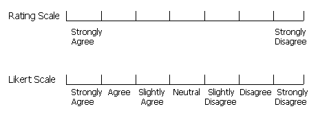
Multi-point rating scale – a number of points on a scale are provided which give a range of responses e.g. ranging from ‘Strongly agree' to ‘Strongly disagree' as illustrated below. A variation of this is the Likert scale (illustrated below) which indicates the meaning of each point e.g. instead of simply putting ‘strongly agree' at one end of the scale and ‘strongly disagree' at the other, the intermediate points of ‘agree', ‘slightly agree', ‘neutral', ‘slightly disagree', and ‘disagree' are included.
Ranked order – rather than giving the subject a scale from which to pick their responses, this approach requires the use to specify their preference for items in a list. For example, a subject may be asked to rank (using the numbers one to four) their perception of the usefulness of four different commands.
We have looked at two main ways to get feedback from users about user interfaces – interviews and questionnaires. They both have their strengths and weaknesses, and give different kinds of results. Next we will look at how potential users can be utilised to provide more rigorous results than we could get from the user observation discussed previously.
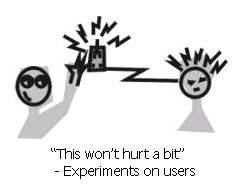
Of course, we don't mean experimenting on users, but rather performing experiments in which subjects participate. Instead of simply giving users tasks and observing how they perform them, experimentation is concerned with attempting to provide some empirical evidence to support some hypothesis. In the case of user interfaces, a hypothesis is usually some supposition that one user interface will be better than another in some respect.
Essentially an experiment involves two sets of users whose situation differs in only one respect – that which is being tested. For example, in an experiment to determine whether a trackpad is quicker to use than a mouse for selecting objects on the screen the two sets of subjects would be treated identically except that one set would use a trackpad and the other a mouse. In this example experiment the hypothesis might be that ‘using a mouse is quicker than using a trackpad for selecting objects on the screen'.
This simple example highlights many aspects of experimental design. First off, the hypothesis is some prediction we wish to test (here that a mouse will be quicker to use than a trackpad) – this has itself probably been derived from some previous research or observation. Secondly, we need to be explicit about what kind of difference we expect to see – this is the thing we are going to measure in the experiment and is referred to as the dependant variable. In this case it is the time to complete tasks with the computer (the prediction was that using a mouse would be quicker than using a trackpad). Thirdly, we need to state what we are going to change between the different sets of subjects – the thing that we change is referred to as the independent variable. In this case it is the kind of input device used – either a mouse or a trackpad. Usually in experiments to do with user interfaces we keep the task the same across all subjects so that we can determine the difference between user interfaces for the same task – therefore it is important to select tasks which can be performed using the different user interfaces. Finally, it is important in experiments to avoid confounding variables. These are things which are beyond your control and might effect the result of the experiment and should therefore be avoided. In this case the fact that most users of computers currently use mice rather than trackpads could be a confounding variable as the subjects would be more experienced with the mouse and so probably quicker by default. In order to remove this confounding variable we could select only novice computer users for the experiment i.e. those without any experience of using computers and therefore, we might assume, mice.
As mentioned previously, independent variables are the factors that we change between sets of subjects. Previously we considered the type of input as an independent variable – either mouse or trackpad, these are levels of the independent variable. In this example there are two levels of the independent variable, but more complex experiments may involve more than two levels of independent variable, and may also involve more than one independent variable. Each unique combination of independent variable levels is referred to as a condition. So, for our simple example there are two conditions in the experiment – one where subjects use a trackpad, and another where they use a mouse. If we were to build on the design of this simple experiment by including another independent variable we would increase the number of conditions in the experiment. For example, we may want to change the hypothesis to be that ‘using a mouse is quicker than using a trackpad, and providing on-line help makes them easier to learn to use'. In this case we would have an extra independent variable – the kind of help provided. We might wish to have three levels of this independent variable – no help, simple textual help, and interactive help. The following table illustrates how these two independent variables and their levels combine to produce six conditions in the experiment.
| Input with Mouse | Input with Trackpad | |
|---|---|---|
| No help | Condition 1: No help, mouse input | Condition 2: No help, trackpad input |
| Simple Text Help | Condition 3: Simple help, mouse input | Condition 4: Simple help, trackpad input |
| Interactive Help | Condition 5: Interactive help, mouse input | Condition 6: Interactive help, trackpad input |
Dependant variables are those things that we are trying to measure to support or disprove our hypothesis. Therefore they need to be things that are easily observed and measured, for example:
The time it takes to complete a task
The number of errors made during the experiment
The time taken to recover from an error
Number of times help is used
Length of time help is used for
Time spent before responses formulated
The dependant variables above produce quantitative data – i.e. numerical results. We might also use qualitative data such as subjects' preferences – how much they liked the system, or the quality of product produced at the end of the experiment. Qualitative data such as user preference can be gathered using interviews or questionnaires as discussed previously.
Recruiting enough subjects is one of the hardest parts of conducting an experiment. Typically at least ten subjects are needed per condition to provide statistically significant results – results that we are pretty sure could not have happened by chance. For the more complex experiment proposed previously this would require sixty subjects (ten per condition) – attracting so many potential subjects usually requires some incentives such as cash or unit credits for students. The use of each subject in only one condition is referred to as between-groups design. We can reduce the number of subjects needed by reusing subjects in different conditions – referred to as within-groups design. However, subjects may then carry over experience from one condition to another and so introduce a confounding variable into the experiment.
Supposing we were setting up the simple experiment described above which attempts to show that using a mouse is quicker than using a trackpad. The independent variable in this case is the type of input, with two levels – mouse or trackpad. There are therefore two conditions – 1) mouse, 2) trackpad. Suppose we manage to find ten subjects for the experiment: Ann, Bert, Carol, Derek, Eric, Fred, Gary, Harry, Iris, and Joan, then we can assign the subjects as follows:
Table 9.1. Between-groups design
| Mouse input: | Ann | Bert | Carol | Derek | Eric |
| Trackpad input: | Fred | Gary | Harry | Iris | Joan |
Table 9.2. Within-groups design
| Mouse input: | Ann | Bert | Carol | Derek | Eric |
| Trackpad input: | Ann | Bert | Carol | Derek | Eric |
We use statistics to determine whether an independent variable (such as the kind of input device) has an effect (positive or negative) on a dependant variable (such as the time to complete a task), and that this has not come about by chance. A thorough coverage of statistical analysis is outside the scope of this unit – suffice to say that we are looking for results that are statistically significant, that is, we believe that they did not occur purely by chance.
To sum up, performing an experiment involves the following stages:
Formulate hypothesis – some statement that you wish to test in the experiment
Identify the variables – independent, dependant, and confounding
Decide on the levels for the variables
Select subjects – decide who would make suitable subjects
Decide on the experimental design – within-groups or between-groups
Decide what tasks are to be performed
Perform the experiment
Analyse the results
This part of the unit has looked at how evaluation can be undertaken using potential users of the system. The fact that we are using potential users to test the system means that we can feel pretty confident that if the user group involved in the evaluation finds it easy to use then so will real users of the system. However, this might be just for the limited task(s) we asked the users to perform. Average users are not experts on evaluation and so would not be able to identify possible additional problems. Moreover, evaluations involving users take a long time. In our simple experiment involving users we needed sixty subjects to test two factors of the interface design – kind of input, and kind of help. Each test of the system may take at least an hour, and then the analysis time must also be taken into account. The next sections discuss alternatives to user testing which have their own pros and cons.
Design an experiment to determine which sounds users prefer to use as email arrival notification (e.g. a simple beep, a duck quaking, someone coughing, a trumpet etc.). Extend this experiment to consider what visual notification they prefer - none, a flashing icon, or a dialogue box. Think about the hypotheses and variables, and suitable people to act as subjects.
Try to address the same questions using a questionnaire - what audio and visual indication do people prefer when email arrives. Consider how you could make the questionnaire more general so that any member of the public could complete it. Also, discuss how this would feed into the design of email programs.
A discussion on this activity can be found at the end of the chapter.
Compare the use of experimental studies to user based observation. Discuss the differences between the approaches and the different kinds of information that can be acquired from them. Also consider the different situations in which they are appropriate.
A discussion on this activity can be found at the end of the chapter.
What are the differences between concurrent and retrospective protocols involved in user observation? What effect do these differences have on user observation?
Answer at the end of the chapter.
In an experiment to determine which user interface (command-line, desktop metaphor, or virtual environment) allows users to perform their task quickest, what might the following be:
The independent variables and their levels
The dependent variables
The conditions
The confounding variables
Answer at the end of the chapter.
Evaluating systems with potential users means that we can get some idea of how it would be received by people when they use it. However, potential users have not typically been trained to identify usability problems. In this section we look at the use of trained evaluators in the evaluation of systems.
In order to address the problem of costly evaluations involving tens or hundreds of users, Molich and Nielsen (1990) devised a technique called heuristic evaluation. In their approach a heuristic is a usability principle against which the system is evaluated by trained evaluators. They initially considered ten heuristics, but later went on to refine them further.
In an evaluation there are typically three to five evaluators who each assess the system (or a prototype of it) against the ten heuristics. Before performing the evaluation all the evaluators will need to be trained in terms of the evaluation technique, and the tasks that the system is supposed to support. The evaluation itself usually involves working through a scenario of use (an example task that users might perform with the system). In order to identify problems thoroughly the evaluators usually work through the scenario twice – once to get an overview of the system, and the second time to assess the usability in depth. After they have completed the evaluation the lists of problems found are compiled into a coherent set – using multiple evaluators means that there is more chance of identifying a coherent set of problems as each evaluator probably perceives problems slightly differently. The problems in the collated set are then rated according to a severity scale (discussed later). Finally, the problems found are fed back into design to improve the next design of the system. As discussed earlier in the unit, this form of iterative prototyping and evaluation works best if the evaluation occurs early in the development process – before too much coding time has been invested in the system.
The first set of heuristics developed for heuristic evaluation are listed below. Typically the evaluator would work through the given scenario trying to decide whether the heuristics were violated or not.
simple and natural dialogue – is the interaction with the system clear and concise?
speak the users' language – can the user understand the information presented to them? E.g. is there too much jargon?
minimise users' memory load – does the system rely on users remembering complex or meaningless pieces of information? E.g. pressing ctrl+alt+del is a pretty meaningless way to bring up the task manager for a novice user. Another example might be a system in which users cannot copy information from one window to another. Therefore they have to memorise the information and retype it. This is a large burden for users' memory, instead the system should be developed to support such copying (maybe it wasn't though of in the initial design – another reason for more iterative prototyping).
consistency – do things happen differently in different parts of the system? E.g. the operation to save a file should be named consistently in different parts of the system, not save in one part and write in another.
provide feedback – does the system inform the user about what is happening? E.g. highlighting buttons when pressed is good feedback, as is showing an hourglass when the system is busy.
clearly marked exits – can the user easily abort an operation? E.g. in wizards there should be some way of escaping from the sequence determined by the wizard – and it should be obvious how to do it.
provide shortcuts – if the user becomes an expert, will they be able to use shortcuts to speed up their performance? E.g. providing keyboard based shortcuts for menu items.
precise and constructive error messages – just telling the user that there was an error does not help them to understand the system. Does the system explain why there was an error and what could be done about it?
prevent errors – if possible, does the system prevent users from making errors? E.g. if a field requires only numerical data, does the system prevent the user from entering letters?
adequate help and documentation – could the user work out how to use the system from the help and documentation provided?
As we mentioned before, once the usability problems have been identified using the heuristics, the severity of the problem is rated. Rating is done individually by evaluators and then, as with the problems, the ratings are collated to get the consensus opinion. The rating itself is a combination of the frequency of the problem, its impact, and how persistent the problem is (is it a one-off, or does it happen each time) and is a number from zero to four on the following scale:
0 - don't agree that it is a usability problem
1 - it's a cosmetic problem
2 - minor usability problem
3 - major usability problem - important to fix
4 - usability catastrophe - imperative to fix
From looking at this scale you will probably realise that it is often hard for evaluators to decide which rating is appropriate.
As mentioned previously, the initial set of heuristics were refined after extensive use. These refined heuristics are discussed below. Note how some of the heuristics have remained unchanged (e.g. 10: ‘help and documentation') whereas others have changed completely (e.g. 1: ‘simple and natural dialog' is no longer present) – why do you think that is?
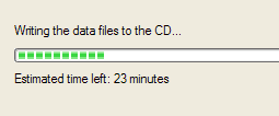
visibility of system status – does the system keep the user informed about what is going on? E.g. indications of response time. As a general rule, for response time, if it is less than 0.1 seconds then no special indicators are needed. However, after about 1 second users tend to loose track of what is going on, indeed, 10 seconds is roughly the maximum duration a user will stay focused on one action. For longer delays than this a percentage-done progress bar should be used to indicate what the system is up to e.g. whilst writing a CD, the software shows the following dialog which includes a progress bar, indication of what it is currently doing, and expected time remaining to complete the activity.
match between system and real world – does the system speak the user's language (original heuristic 1.2) and follow real world conventions? A classic example of this heuristic being flouted is the way in which discs are ejected from MacOS based computers. Usually the ‘trash' on the desktop of a MacOS is used to delete files i.e. to throw them away – matching the real world. However, to eject a floppy disc it must be put into the ‘trash' which breaks the match between the system and the real world (it is also inconsistent – revised heuristic 2.4) as illustrated below.

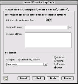
user control and freedom – the user shouldn't be forced down fixed paths - does the user have ‘exits' for mistaken choices? E.g. undo and redo. e.g. wizards (as illustrated below) – users are forced down fixed paths to complete tasks (note the <Back and Next> buttons which dictate the sequence; note also the Cancel and Finish buttons which provides some level of user freedom), this is OK for uncommon tasks such as configuring a modem, but not good for frequent tasks which should have a different style of interaction.
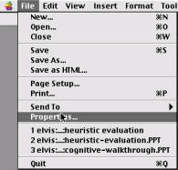
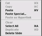
consistency & standards – as well as the consistency within the system as discussed in the previous set of heuristics, we also need to consider consistency between applications. E.g. in Mac OS X there are consistent menu names and shortcuts between different applications – ‘New', ‘Open', and ‘Close' are all consistent across applications, as are their shortcuts (illustrated in the following picture).
Note also in the above illustration that all the words are consistent in terms of their typography – which letters are capitalised and which are not. Mixing capitals and lower case words inconsistently may cause confusion in users, but would probably not be spotted during the user observations discussed earlier in the unit.
error prevention – see original heuristic 9.
recognition rather than recall – generally the same as original heuristic 3 (minimise memory load).
flexibility and efficiency of use – does the system support shortcuts for experts (illustrated by the shortcuts provided in the following MacOS menu) and is it possible to tailor the system? E.g. providing support for macros to automate frequent tasks.
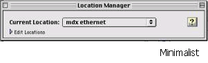
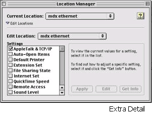
aesthetic and minimalist design – does the system present irrelevant information? E.g. the following Mac OS X illustrates an attempt to hide information from the user when it is not relevant – the first dialogue below shows the minimal information needed, but can be expanded to the second interface if the details need to be viewed and edited.
help users recognise and recover from errors – are the error messages in plain language? Do they precisely indicate the problem, and importantly, constructively suggest a solution? E.g. in the past, command-line based systems have been known to give errors such as the following – this tells the user the problem, but the solution is hardly constructive.
 |
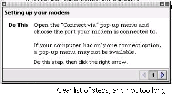
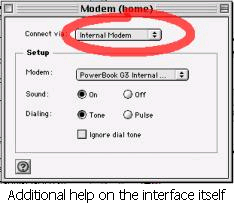
help and documentation – is the information provided easy to search, focused on the user's task, and not too large? Moreover, does it list concrete steps to carry out? E.g. Mac OS X provides constructive help on setting up the modem for you computer as illustrated below - there is a list of concrete steps which relate to the task at hand and are not too long. In addition there is some indication on the actual interface in question and of what operations need to be carried out so reinforcing the help (indicated by the red ellipse on the modem control panel below).
So far we've considered what the heuristics are, and given some examples of interfaces meeting or violating them. Here we give an example of how the severity might be assessed. Consider the example given in the original heuristics 1.4 (Consistency). In that example the interface used the string Save on the first screen for saving the user's file but used the string Write file on the second screen. Users may be confused by this different terminology for the same function. By a process of elimination we can arrive at a severity rating for this example. First, it is a problem, so that rules rating 0 out. Then, its more than a cosmetic problem (just something to do with the prettiness of the interface) ruling out rating 1. It might be a minor or major usability problem, but it is definitely not a usability catastrophe. Herein lies one of the problems with heuristic evaluation which explains why several evaluators are used and then the consensus taken – how can we make such an objective decision about something which may in some ways be subjective i.e. my own feelings about the interface. Personally I would give it a rating of 3 – major usability problem which is important to fix – as I believe that it could cause some real confusion for users and should really be fixed for the next design.
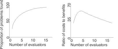
Once again we have touched on the subject of the number of evaluators needed for a heuristic evaluation. Nielsen himself discusses this issue and considers that a single evaluator achieves poor results as they typically only find 35% of usability problems whereas 5 evaluators find around 75% of usability problems. This raises the suggestion of just throwing as many evaluators as possible at the problem. However, Nielsen argues that many more evaluators won't find proportionally more problems as illustrated in the first graph below. Moreover, as each evaluator costs money to employ the cost benefit ratio decreases rapidly after five evaluators as illustrated in the second graph below.
Compared to heuristic evaluation, cognitive walkthroughs are less prescriptive in terms of the kinds of problems that should be looked for in the evaluation. The emphasis is more on learnability and the basic approach is that the evaluators step through a scenario using the system and at each step attempt to decide whether users would have trouble in moving to the next – hence the term walkthrough.
The first stage of a cognitive walkthrough is to define the inputs to the evaluation - what things we are going to consider in the evaluation. The first input we need to consider is the users. In particular, who are the typical users going to be, and what experience and knowledge can we expect them to have. Once we have defined who are potential users are we consider what tasks they will be performing with the system. The descriptions of the tasks to be supported often come from the Task Analysis stage (see Unit 8). Once we have understood the tasks we need to determine the action sequences of the tasks. That is, we need to work out what each step involved in completing the tasks are, and what sequence they are in. This description of the task action sequence will constitute the steps that are walked through by evaluators later. Finally, we need a description of the system itself – in particular its user interfaces. This may be an implementation of the interface, a prototype, or some mock up drawn on paper, just so long as the task can be stepped through using the description given.
Once the inputs have been defined we need to select our analysts to perform the evaluation. Typically a developer can fulfil this role with a little training. However, better results are obtained when people with some knowledge of cognition (see Unit 4) are used as they will have a better understanding of users' cognitive limitations.
Now that our inputs have been defined and our analysts selected we can proceed with the evaluation. Each analyst steps through the sequence of task actions that are necessary to complete the task. At each step the following questions are asked:
Would a user try to achieve the right effect?
Would a user notice that the correct action is available?
Would a user associate the action with the desired effect?
If correct action performed, would progress be apparent?
For each of these questions we need to note down not only the answers, but also additional important information including the knowledge requirements of the user, our assumptions about the user, and possible design changes. This extra information can provide important insights for redesign of the system.
Finally, once we have stepped through the task actions and noted down all the problems and extra information we need to work out how this feeds into redesign of the system. Considering the first question above first, supposing the user fails to try to get the right effect (i.e. perform an action) with the user interface, we need to consider what could be done in the redesign to address that problem. Two possible solutions are simply to remove that action from the task (maybe our task analysis had a mistake in it), or to prompt the user for the action, so making it clear that they are supposed to do something at that point. Alternatively, some other part of the interface could be changed so that the user knows that they should try to perform an action.
Moving on to the second question – whether the user notices that the correct action is available. We need to consider what to do in terms of redesign if the user does not notice that the correct action is available. One possible solution is to make the action more obvious in the interface – maybe it is hidden in some sub menu. Similarly, failing the third question would mean that the user did not know which action is the correct one. In this case we might label parts of the interfaces such as buttons or menu items based on our belief's about potential users' knowledge – what labels would mean that users could differentiate actions.
Finally, supposing progress is not apparent when a correct action is performed (the fourth question). This means that the user has no way of knowing if things are going well with their attempt to complete their task. A redesign solution would be to give some feedback to the user, maybe at least an hourglass to indicate that some action is being performed. Better still, the interface can indicate that progress is being made and additionally indicate what it is doing to contribute to this progress (see the example of heuristic 2.1 in the heuristic evaluation section).
To illustrate the use of cognitive walkthrough, consider the following example of programming a video recorder to record a program, using the remote control.
First we determine the inputs, in this case our potential user group will be anyone with some knowledge of working a video recorder. Next, our task is to program the video to record a program, and we are using the remote control. The specific task instance that we are going to use for the test is to record a program on BBC2 (channel 2 on the video recorder) which starts at 10:30pm and finishes at 11:20pm, and is shown tomorrow. We will work out the action sequence from the description of the interface (another input) that follows.
The remote control handset which we will use to program the video is illustrated below in ‘dormant' mode, that is, when no programming is being performed.
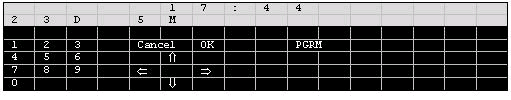
You can see from the interface several groups of objects. The light grey area is the LCD which displays numbers to the users – above this is the current time (17:44) and the date (23/5). The black area contains several buttons which are grouped together into numerical (on the left), navigation (in the middle), and others (to the right of middle). Only one of these other buttons has been shown as it is the only one relevant to the task – the PGRM, or program button. Once this button has been pressed the remote control goes into programming mode. So, if we list the actions of the user and the responses of the remote, our first action is to press PGRM, and the remote's response is to change the display as illustrated below.
For the sake of brevity, the following description only lists the start of the action sequence for programming the video recorder to record our chosen program in terms of user actions and remote control responses.
| Action A: | Press PGRM. |
| Response A: | Display changes to program mode. The digits 1 2 3 4 at the top left of the display flash (see diagram above). |
| Action B: | Press => |
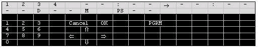
| Response B: | 1 stays on, other numbers disappear. 17 starts flashing and 00 is steady next to it as illustrated below. |
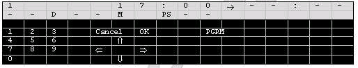
| Action C: | Either press up and down arrows until 17 is replaced by 22, or type 22 on the keypad. |
| Response C: | 22 displayed instead of 17. |
| Action D: | Press => |
| Response D: | 00 flashes to the right of 17: |
Even with this short action sequence there are plenty of design issues raised. Firstly, in action A, we might wonder whether the user notices that the correct action is available (question 2), or whether they would associate pressing that button with programming the video recorder (question 3). It is not at all clear that the user should press PGRM to set the video up to record. At least when we press PGRM our progress is apparent as the display changes (question 4).
In response A we encounter a display in which four numbers are flashing. This number refers to the number of possible timed video recordings rather than the channel number as user might well expect. This response A means that user might not try to achieve the right effect at that point (question 1) as they attempt to set the channel to be recorded, instead of the number of the timed video recording as the remote control expects. Once the appropriate recording number has been selected (in this example it is 1 by default) the user must try to move on to set the start time of the recording. We can assume that they know that they should do this (question 1), but how they move on is another issue. In order to move on to the next step the user must press => , but maybe they would have thought that OK was the most appropriate button (question 3). Once again, when the correct action has been performed the display changes to flash the number 17 and so we can see that progress is apparent (question 4).
Perform a heuristic evaluation of the remote control example. What usability problems do you find, and how could you improve the user interface.
A discussion on this activity can be found at the end of the chapter.
Continue the cognitive walkthrough of the remote control example (the last two actions). What extra usability problems do you find and how could the remote control be changed to address all the issues raised.
A discussion on this activity can be found at the end of the chapter.
Consider the remote control example given in the discussion of Cognitive Walkthroughs. Write down which of the first set of heuristics (from Heuristic Evaluation) you think the remote control as described violates, and which aspects meet these principles.
Answer at the end of the chapter.
In this section we looked at evaluator based evaluation which differs from user based evaluation in that the people using the systems, or designs, to be evaluated have been trained in identifying usability problems. However, they may not know as much about the task that the system is designed to support as actual users. Moreover, they are not necessarily the kind of people that will use the system in the future. Furthermore, compared to user based evaluation, evaluator based evaluation takes far less time, effort, and participants. It also does not require evaluators to interpret users' actions (from observation) which may not always be accurate. In order to get an all round idea of the usability of a system it is probably a good idea to alternate between user based and evaluator based evaluation. The next section will cover another important form of evaluation which should be included in this set of alternatives.
So far we have considered evaluation techniques in which someone (a user or an evaluator) actually uses the interface, or some mock-up of it. Another approach to evaluation covered in this section is the use of models (see Unit 7 for a discussion of modelling) of the interface and understandings of human cognition to evaluate interfaces without actually using them.
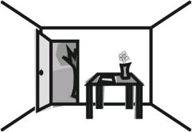
Whilst developing ICS (see Unit 7), May, Scott and Barnard (1995) developed a method of analysing user interfaces which takes into account human perception (a function of human cognition – see Unit 4). Consider the following scene. In this image we perceive a table in a room whose door is open. Outside we see a tree and a hill. Inside, on the table, we see a vase of flowers and a piece of paper. The key is that we perceive that this is what the collection of lines indicates – that the lines represent these objects. So, when looking at an image such as the one below, or a user interface, we apply psychological processes to interpret the image as a set of objects. Importantly, this perception of objects is focused. That is, we look at particular parts of an image and concentrate on them. For example, we might look at the table and then the objects that are on it (the vase with flowers and the paper), or we might look at the door and the objects we can see through it (the tree and the hill).
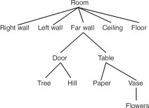
This view of perception assumes that our perception works hierarchically. The figure below illustrates a hierarchy for the objects in the figure above referred to as an object structure diagram. Using this hierarchical structure we can see that what we perceived is constrained by the level we are on.
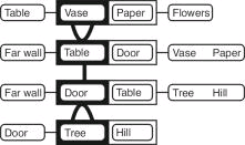
The changes in focus of perception as we view different parts of the scene are referred to as transitions. Below is a transition diagram of someone changing from focusing on the vase (containing flowers) on the table, to focusing on the tree outside. Transition diagrams show change in focus as a sequence of steps from top to bottom of a diagram. In the diagrams the object currently focused on is outline in black (in the first step below that is the vase). To the right of the focus object and within the same box are the focus object's siblings – those objects on the same level of the hierarchy. In the first step below the only sibling of the vase is the paper. To the left of the focus object is the parent of that object – the object that is directly above it in the hierarchy. For the case of the vase the parent is the table. Finally, to the left of the sibling objects are child objects of the focus object which in the case of the vase are the flowers. Thus, all possible changes in focus are thus shown on one line e.g. from the vase the focus could change to its parent (to the left in the diagram, the table in this case), a sibling (immediately to the right in the box, paper in this case), or its children (to the right of the box, flowers in this case). So there are three kinds of movement which need to be represented in the diagram. Movement up the hierarchy to the parent is indicated by È (the first transition below is up the hierarchy from the vase to the table – notice how the focus object changes in the next line, as do the parents, siblings, and children). Movement between siblings in the hierarchy is indicated by ½ as illustrated in the second transition below from table to door (both children of the far wall, hence the far wall stays as the parent between steps 2 and 3). Finally, there are movements from parent to children which are indicated by Ç as illustrated in the third transition from door down to its child tree.
You might be wondering what on earth this has to do with evaluating user interfaces. Such understandings of perception come into play when we consider the tasks users are to perform and the user interfaces they use to complete their task. May et al. give an example of a caretaker of a building who, among their many other tasks, has two tasks which are to either check the heating and/ or lighting in a particular room, or to check the heating and/ or lighting in the whole building. Rather than actually having to go to each room to check it the caretaker has a display panel in their office which shows the status of lighting and heating in each room. The two tasks require different user interfaces to this display panel as discussed below – the key is that good design matches task structures to user interface structures.
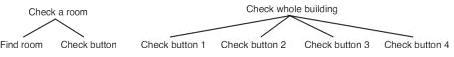
Assuming that there are four rooms in the building, the following diagram illustrates the hierarchical composition of the two caretaker tasks we are considering (such diagrams are referred to as task structure diagrams – it is important not to confuse task structure diagrams and object structure diagrams).
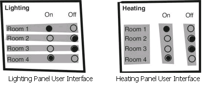
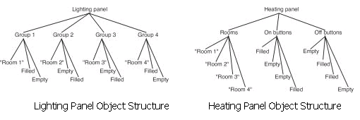
The caretaker has two interactive display panels in his office which are shown below. For each room there is an indication of whether the lighting or heating is on or off. The caretaker can press any of these buttons to change the state of the lighting or heating. These illustrations are followed by the object structure diagrams of these users interfaces – that is, how the objects in the display are perceptually grouped (by relative position of objects and shading in these interfaces). From these object structure diagrams and our task structure diagrams above we shall evaluate the interfaces with respect to the tasks.
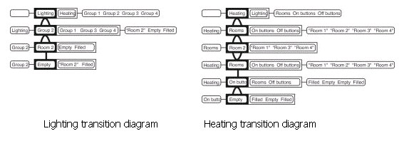
Now we have descriptions of the structure of the tasks and the object grouping in the interface. From these we can make assessments of the suitability of the different interfaces for different tasks. Consider the task of turning the heating and lighting on in room 2. When turning the lights on in room 2 the caretaker focuses on the lighting panel, then finds group 2, then clicks the empty button to turn it on. In contrast, to turn the heating on the caretaker first focuses on the heating panel, then the rooms group to find room 2, then changes to the on buttons group to select the appropriate button to turn the lights on. These two different ways are illustrated in the following transition diagrams. The extra transitions involved in using the heating panel tell us that the organisation of the lighting panel is better for the task of turning something on in a specific room. However, this may not be the most appropriate object grouping for other tasks.
 |
Construct the object structure for the remote control example used in the cognitive walkthrough section. Then consider the transition diagram for the given task of setting the video to record. What problems can you identify using this approach?
A discussion on this activity can be found at the end of the chapter.
In the discussion of perception based evaluation an example involving interfaces to lighting and heating panels was given. Transition diagrams for turning the light and heating on in one room were given and the differences discussed for the different user interfaces. Construct the transition diagrams for checking whether the lights and heating are on in each room. What does that tell you about the suitability of the two user interfaces for this new task?
Answer at the end of the chapter.
Perception based evaluation used an implicit notion of perception developed from psychological understandings of cognition. GOMS contrasts this by using an explicit model of cognitive processes developed from studies of users. GOMS itself stands for Goals, Operators, Methods, and Selection rules (see Unit 7). The quantitative predictions of execution time produced by GOMS can be used to compare designs. For example, to compare the time taken to delete all the files in a directory with a command-line and a graphical user interface, we would see the following predictions:
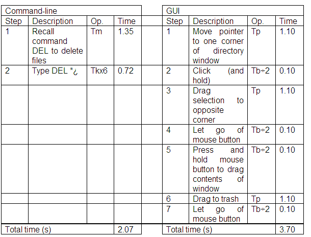 |
From this analysis a command-line interface would be quicker to use to delete the contents of a directory than a graphical user interface. Of course, this assumes that the user is an expert and knows how to issue the appropriate command to delete the files. The command-line interface is likely to be even better for deleting files using wildcards e.g. deleting all files ending in .txt.
GOMS can be used to compare different user interface designs, and to support profiling of interface – describing the interface in terms of the time taken to perform various tasks. However, the evaluator must pick the users' tasks and goals which may mean that evaluators only find what they are looking for.
The application of GOMS is not as easy as heuristic analysis, or cognitive walkthrough (discussed previously) as it takes lots of time, skill, and effort to complete an analysis. Also, as it is concerned with the time it takes to complete tasks, GOMS does not address several important UI issues, such as readability of text, memorability of icons and commands, and does not address the social or organisational impact of introducing new systems into the workplace.
GOMS is intended to predict time to complete tasks for expert users. What tasks are there that can be completed quicker by and expert using a mouse than a keyboard? Use GOMS to compare keyboard and mouse interactions in terms of predicted task execution time.
A discussion on this activity can be found at the end of the chapter.
In this section we have discussed model based evaluation which differs from the previous forms of evaluation in that nobody actually attempts to use the system or design in order for it to be evaluated. The approaches covered can give several qualitative and quantitative predictive measures of user performance with the system. The key is that they are predictive – they attempt to give some idea of what a use probably would do with the system. Furthermore, the models can be used to attempt to explain why the results are what they are. For example, the results of perception based evaluation can be explained in terms of understandings human perception. Even though constructing the models and running the evaluation in this way can be time consuming, it is still less work that user experimentation. Moreover, the models developed for such evaluations can easily be modified when the design changes. Therefore we can quickly get some idea of the impact of changes in the design. An important future development will be the construction of tools to assist evaluators in using model based approaches as they can often be difficult to learn and understand.
Discuss the difference between approaches to evaluation which use models, and those that do not. Consider their appropriateness and the kinds of evaluation they can be used for.
Answer at the end of the chapter.