Unlike with software development, there are no accepted, well organised and documented methods for developing Web sites. There are, however, some good practices — for example, it is best to avoid 'technology traps' by not committing to new, but untried, technologies.
The development of many websites is driven by the enthusiasm of designers and implementers — people who are often keen to use the latest technology. Being driven by technology rather than business and customer needs can lead to sites that are slow in execution, complicated to use, and do not achieve the intended results. Ironically, committing to a new technology too early can cause a website to rapidly look dated, either because the technology did not become popular and so stayed in an old form, or because the adoption of the new technology was so expensive that little budget remained for site maintenance.
As a general rule, avoid the unnecessary use of technology. While doing so, also recognise that any technology that has been avoided at some point in a website's lifetime may become vital to the site as the site's needs change, or even as user interface fashion progresses. This idea of change, and the fluidity of the guidelines, is important. Technology that is unnecessary today may be acceptable or even necessary in a few years time. For example, it was once considered inadvisable to use frames or scrolling text. Now, these are less of an issue: frames are supported by most browsers in current use, and users are used to scrolling. (However, we will still discuss these below.)
The first activity of website development is the definition of the site's purpose. Begin with the broadest idea and refine this.
Once the broad, high-level description of the site's purpose is known, refine the goals in more detail. Ask yourself, "What are we trying to achieve?" and answer the question in a way that adds detail to the description. Do not only consider the obvious questions concerning the site's purpose, but also the issues around the implicit messages a potential customer might receive from the site. For example, if a website selling holiday packages offers most of its packages in, say, Italy, as that is where most of the company's customers have traditionally wanted to go, then the site might give the impression that Italy is the only country that the company knows about. While some messages should be avoided, there might also be positive messages that the site should given, such as those concerning the quality of the service, or how long the company has been in business.
Thus, one aspect of website design is to identify primary and secondary goals for the site. The primary goals may be achieved by directly implementing facilities to meet those goals, for example, by providing a catalogue of goods and services. The secondary goals may be achieved in more subtle ways, by, for example, choosing colours that suggest stability, excitement, or so on; or by providing subtle, positive messages to the customer concerning the company running the website and the services on offer.
Let us pursue these ideas with an example. Say you are in the business of developing software on behalf of clients, and that you also sell programming language compilers and development environments. Your clients might choose both the programming language and a specific compiler for it. For instance, one client might choose Java, and another might choose C++. The second of these clients may or may not have an opinion as to whether Microsoft Visual C++ should be used in preference to IBM's VisualAge C++. You sell both, as well as other C++ development systems, so you can cope with the choice of either. You have decided that the main purpose of your new Web site is to 'sell the services' of your company. How do you determine the details of this? One method is brainstorming, in which a group of people briefly consider all aspects of an idea. Participants in a brainstorming session are expected to contribute to discussions, to arguments in an unstructured, anarchic, often unruly way. They will often jump from one idea to another, calling out words, arguing for and against points — sometimes simultaneously. In brainstorming the ideas of all the participants are initially given equal weighting, so the most lowly employee may argue freely with the most exulted. Brainstorming is usually thought of as a fun way to generate ideas; it is a very creative process and the outcomes can often be surprising with unexpected benefits.
As can be seen from the previous exercise, expressing many ideas using brainstorming or a similar technique, may result in a mixture of ideas concerning the purpose of the site and how to achieve it. Ignore the detail of the 'how' and try to understand what it means. One suggestion of, say, using grey to suggest reliability may contradict a suggestion of using bright colours to convey excitement and being a 'go-getting' company, but that does not matter at this stage. The important information here is that both aspects of the company are to be conveyed. The question is whether it should be a primary or a secondary goal.
One question concerning primary goals that the brainstorming did not settle is that of what the site is primarily selling — software development skills or programming language implementations. The sooner this is answered the better — but it might require debate, and the decision may, to some extent, depend on what can be achieved in the time and budget available for site development. For example, it may be difficult to organise the selling of programming language implementations because the website might have to interact with a database of information about stock levels. Another reason for not promoting that side of the business might be that the company could not cope with too much extra business of that kind. The irrelevance of distance when selling products might increase sales of compilers and programming environments, whereas the need for software developers to meet their clients might naturally limit take-up if that side of the company's business was promoted.
As well as the website developers knowing what the site's purpose is, they must also know its audience. With knowledge of your audience, you can tailor both content and presentation to suit their needs and keep Web customers returning for more business.
Ultimately, knowledge of the business requirements and expected audience is the starting point of understanding the site requirements and design. Knowing these facets provides a foundation for site development. Such a foundation must be the basis for the design. It should drive the design. You must not start with an arbitrary design and force other choices to fit it.
The design of a site involves many considerations, not least of which is navigation, a discussion of which occurs later. Other than navigation, the following need points to be considered as well:
the structure of the site — how the pages are organised (logically, rather than physically on disk);
the possible paths through the structure — both the paths you might prefer or expect a user to follow, and the paths you should provide to make the structure truly hypertext;
the style — the so-called 'look and feel', that is, the layout of the actual pages;
the structure of individual pages — how each page is organised (or how categories of page are organised).
All the above points are related to each, and so it is not possible to prescribe an order in which they should be considered. For example, the structure of the site is related to the possible paths through the site, as will the structure of the individual pages. All should be strongly influenced by the site's purpose and target audience. Now let us consider an abstract view of how a site is organised:
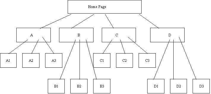
A structure such as the above is sometimes called an information architecture.
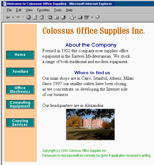
The structure implies that users start at the home page, then visit pages A1, A2, and A3; followed by visiting pages B1, etc., through D3. This sequence of page visits, however, may not be the sequence the user chooses to view. Say the page organisation reflected the departments of an office equipment supplier — desks, filing cabinets, pens, paper, computers, fax machines, and the like. Let us represent these departments as A, B, C, D , as in:
A essentially represents the furniture department;
B is for electronic (non-computer) equipment, such as fax machines;
C is computers and associated items such as, scanners, printers, disk drives, etc
D is copying services, including the production of brochures, business cards, etc.
Clearly, the information architecture is not devised with navigation primarily in mind. Let us briefly consider navigation: imagine a scenario in which a user wishes to buy a computer, a combination fax / scanner / printer, and furniture to hold these. From the home page the user might visit C, for computing equipment, then perhaps move between pages C1 and C2 as they decided which computer and fax / scanner / printer they want. Having bought the computer equipment, the user might want to go directly to A1 for a desk, then A3 for a chair, and finally A2 for a monitor stand. The diagram above does not represent this scenario or even the possible navigation paths. It only present a 'logical' view of how the pages in the website are related to each other.
Now examine a second version of the site structure, with navigation paths added:
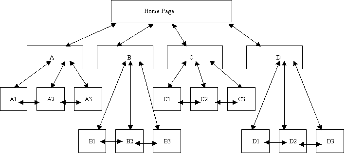
In this second version of the information architecture, explicit navigation paths have been given, each of which is a two-way path. This is based on the assumption that a user of the site would need to move backwards and forwards between 'sub-departments'. Notice that no navigation has been included between departments, between A and B, C, or D. This is an arbitrary decision, which in reality would be made knowing the site's purpose and audience. Navigation planning will be discussed further later in this chapter.
Having come up with a plausible information structure, the structure of the individual pages need to be designed — this is called the Web page architecture, and another design effort is required for this. This should be done before settling on the layout and style. For example, the following diagrams show two possible page architectures for displaying the same information, namely a page of book or report style:
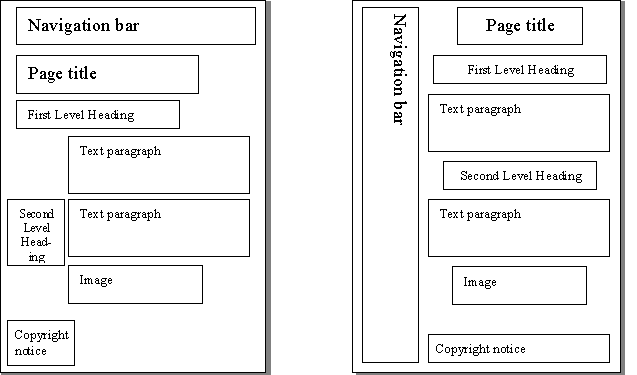
These structures can be implemented in different ways, inasmuch as the fonts, colours, button styles, etc. could be varied for each. These are important facets of style, usually decided by graphic designers. Software developers should be primarily interested in the structure of the page elements. When these have been decided, the graphic designer's 'look and feel' can be achieved using HTML, JavaScript, and so on.
The two figures below show instances of the above page architectures. Both have the same content, but different layouts and styles. The HTML facilities required by each is quite different. For example, it may be convenient to use tables to implement the first layout and frames for the second (although neither have been implemented with either tables or frames). Design is all about making choices, as can be seen here.
As observed in Unit 1, the provision of navigation aids in hypertext documents is very important. Navigation aids prevent users from losing their place. When reading a book, people start at a particular page and read the subsequent pages in order. Perusing a catalogue might not be as linear an activity, but the page numbers, table of contents and the index provide the means to navigate backwards and forwards, and to jump to arbitrary pages. Hypertext documents do not follow this fashion for two reasons
the reader can arrive at any page, via a hyperlink, and
a reader can read or interact with the pages in any order
One technique for designing the navigation paths is to storyboard the tasks that the users might undertake when visiting the site. Storyboarding is a technique taken from cinematography: the story is developed by roughly sketching each scene — as well as the actions in each scene — on a board, and placing each image in the desired sequence. For Web site development each page does not need to be sketch out, but each scenario does need to be documented and analysed.
Ideally, a storyboard should be developed for all the pages in a complex website so that style can be compared with function. As with all these design activities, the storyboard may have to change — but it is easier to change a storyboard than the final product, and a storyboard acts as a good starting point to website design.
Navigational aids are an important ingredient for successful website design. Browsers themselves have a variety of navigation aids including Bookmarks (Favourites) and History lists, while the JavaScript language has facilities to access these. A website designer can make use of these facilities, but the page architecture should provide the navigation aids that are considered necessary.
Overcoming the 'Lost In Hyperspace' problem is a difficult problem to solve. It occurs when a user follows a series of links and discovers that they do not know where they are in a site or how to retrace their steps to a previous page. There has been much research into this phenomenon, but this appears to have been ignored by Web designers.
The 'Lost in Hyperspace' problem can be prevented, or lessened, by applying three rules: in general every page in your website should include
where you are
where you have been
where you can go
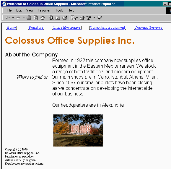
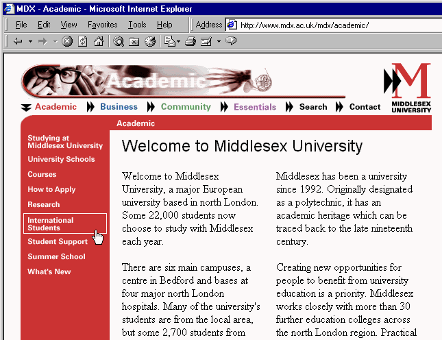
For example, the Middlesex University academic home page,
shown below, has implemented two of these rules. It shows where
the user is by the down pointing double-headed arrow
( )
beside the word Academic. The other words on that navigation bar
(preceded by the
)
beside the word Academic. The other words on that navigation bar
(preceded by the  symbol) show what the designers see as major
navigational steps to other topics. By contrast, under the
'Academic' heading there are nine links, from Studying at Middlesex
University through to What's New. The user has left the mouse
pointer over International Students, which has been highlighted
by a rectangle outline. (You will study how to achieve such an
effect in Unit 15.) These aids meet rules 1 and 3 above. In this
case, rule 2 is provided for by the browser itself.
symbol) show what the designers see as major
navigational steps to other topics. By contrast, under the
'Academic' heading there are nine links, from Studying at Middlesex
University through to What's New. The user has left the mouse
pointer over International Students, which has been highlighted
by a rectangle outline. (You will study how to achieve such an
effect in Unit 15.) These aids meet rules 1 and 3 above. In this
case, rule 2 is provided for by the browser itself.
As mentioned above, books are presented in a linear fashion while hypertext documents can be read non-linearly. The ordering of hypertext documents within a site is a related issue: visitors to a Web page may start in the 'middle', read through to the 'end' and finish at the 'beginning'. Within a single Web page, the top to bottom (and left to right) nature of the text may dominate, but if a user arrives at page somewhere other than at the document's top, there may be no order apparent to the reader. A Web designer must be sensitive to these many possible readings of a Web page, just as they should be sensitive to the navigational possibilities in an information architecture. The implicit ordering of a page architecture must be considered. Dynamically changing content (such as animations or JavaScript-produced content) will influence the order a user reads a page. This is something that does not happen in books!
Clearly, people adopt different reading manners between reading Web pages and books. In their 1997 study, Jakob Neilsen and John Morkes discovered that 79% of people merely scanned the text of a Web page. They found that only 16% read every word. Other work has found that less than 20% of readers scroll beyond the information that is visible. From these findings it could be concluded that Web pages should:
contain 'scannable' text, in which keywords are highlighted to aid quick perusal;
employ meaningful sub-headings;
use bulleted lists to provide a quick summary of the main ideas;
use only one idea per paragraph, concentrating on the introductory words of the paragraph;
use the 'inverted pyramid' style of writing, where the document begins with the conclusion;
use half or less of the word count of conventional writing;
ensure that all the information is visible on the screen without scrolling.
Such guidance should be used were needed, but should not be relied on slavishly. It is important to remember the intention behind the above suggestions. For example, from the third point, do not remember it as a statement to only 'use bulleted lists', but remember that the bulleted lists are meant to summarise information explained fully on the page. The study by Nielsen and Morkes emphasised the need for Web designers to instill in users a sense of the site's credibility, as well as a trust in the content provider: if readers do not believe what they read in any section of a page, they may skip the rest of the page. Credibility and trust are important to businesses wanting to establish commerce on the Net.
Activity 1: Bad Websites
Visit the following websites:
Write down your view of these sites. Choose three of their featured websites and, for each chosen site, identify one aspect of its design that you find particularly poor. Try to find four or five examples of bad Web design and discuss them with colleagues on-line or in tutorial.
See Discussion on Activity 1 at the end of this chapter
Activity 2: Top Ten Mistakes
Go to Jakob Nielsen's useit.com website and read his original 1996 advice on what to avoid when designing a Web site. Then follow the link to his revised (1999) advice and read it. Also have a look at some of the newer top-10 lists that can be found at the bottom of that page.
Take note of the main mistakes he lists and the extent to which he has changed his view. What about the other lists? Are there any inconsistency? Write down what you think of the current advice found on these lists.
Activity 3: Design Issues
Read Nielsen's The Ten Most Violated Homepage Design Guidelines. Can you find an example of common websites that violates these guidelines? Also discuss whether or not you agree with the ranking.
Take note of the main mistakes he lists and the extent to which he has changed his view. What about the other lists? Are there any inconsistency? Write down what you think of the current advice found on these lists.
Hypertext research has shown that a user needs to be able to move between pages in less than a second for the site to have maximum effectiveness. Even with the increased use of fast modems, most pages remain painfully slow to download.
Factors in page download speed that are to a large extent beyond your control include:
the throughput of the server
the server's connection to the Internet
the performance of the Internet itself
the user's connection to the Internet
the rendering speed of the user's browser, computer processor and graphics hardware.
As far as possible, decisions that effect Web page speed should take this information into account. For example, if the website is to be used within a company as an intranet, or with limited access for registered customers as an extranet (see Unit 13), then the configuration of the users' computer systems should be completely known.
The main factor under a Web designer's control is the use of high-bandwidth information:
Video and audio resources require the largest files; streaming technologies are offered by companies such RealNetworks (via their 'real' media formats) and Apple (via QuickTime 4).
Animation formats such as ShockWave (which include video and audio) require external applications or plugins in order for a browser to view them. This requires the designer to consider the large file sizes of the content, and interaction with external software.
Graphics files may be large: JPEG is often used for high definition images and GIF for simpler ones. Various strategies may be employed to reduce the number of colours contained in an image (and hence reduce the file size, download time and the rendering time). For example, the distracting animation used earlier can take between 2 and 8 seconds to download depending on modem speed; this time can be reduced by half when colour reduction and other optimisations are used. The technologies involved are discussed later in this unit.
Apart from reducing image file sizes, a number of other techniques can be use to improve the apparent performance of a browser. For instance, browsers cache all the content that they download on the assumption that this content may be used again. So, a graphic used on a variety of pages can be reused from the cache rather than downloaded, as long as only a single copy of the image is used on the website. Using multiple copies of the image will circumvent any advantage that could be obtained from the browser's cache.
Specifying the size of the image to be displayed allows the browser to reserve the space needed for the image while the image is downloading; in the mean time, the rest of the page can still be displayed:
 <img SRC="http://www.myCompany.com.au/general-images/
        headquarters-photo.jpg" height=200 width=320>
There are also various 'tricks' that can be used to make download speeds appear faster. For example, an image can be downloaded twice — once on a page where the image will not be displayed (by setting the image width and height to zero), and then once again on a page where the image will be displayed. The browser will, when downloading the image for the first time, store it in its cache. Later, when the image should be shown, the browser will find the image in its cache, and so the image will appear to have downloaded much quicker than it truly has.
Netscape Navigator also provides a LOWSRC attribute for the <IMG tag; this allows for the designer to specify a file to load in advance of the true image. This should be a temporary, low-resolution, low colour, small image file — essentially a place holder for while the true image is being loaded.